
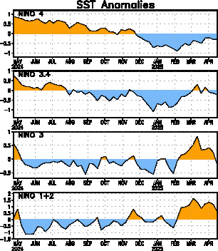
Positive Nino 3.4 values indicate warmer than normal sea-surface temperatures. Since about mid-March of this year, the Nino 3.4 index has been climbing steadily, now up to near 1.7. Anything above 1.0 is considered an El Nino event, so this is definitely a legitimate, full-blown El Nino.
We have dynamical and statistical models that try to forecast what the Nino 3.4 index will be like for the coming months. Here are those model projections, though they are almost a month old:
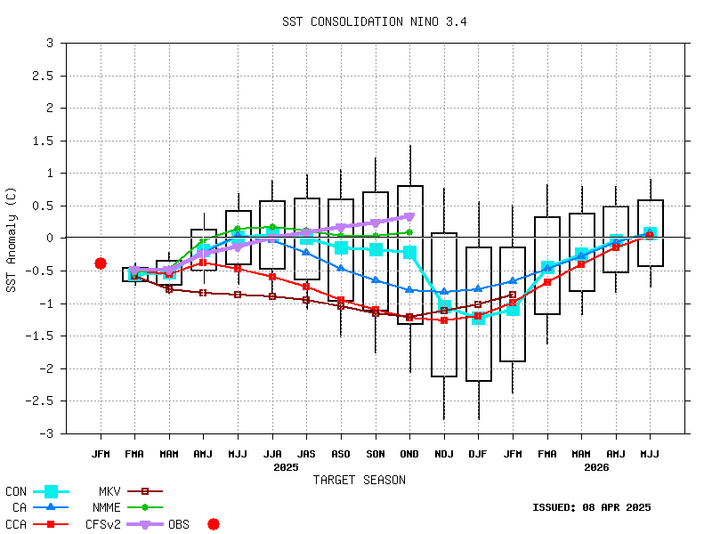
These forecasts are for three month periods, given by the letter abbreviations at the bottom on the x-axis. You can see that by the late fall into winter (around the OND, NDJ, and DJF time) the Nino 3.4 index is predicted to peak. There's a lot of spread, but the average maximum is between 2.0 and 2.5. Keep in mind that the 1997-1998 El Nino event---the largest we have on record---peaked at a Nino 3.4 value of 2.3. It's definitely possible for us to meet or beat that strength...
One of the major reasons we care so much about El Nino is that it is one of the few phenomena that can give us information about what the large-scale weather patterns will be like months in advance. We've gotten rather good at synoptic-scale weather prediction, with forecasts good out to 10 days or so. We also feel we have a reliable handle on large-scale climate impacts on the scale of years to decades. But it's that in-between area---regional variability in large-scale weather patterns on the orders of weeks to months---where we really don't have much predictive skill. Thus, anything that can give us a signal as to what may happen in that time frame is highly valued, and El Nino is the best tool we have.
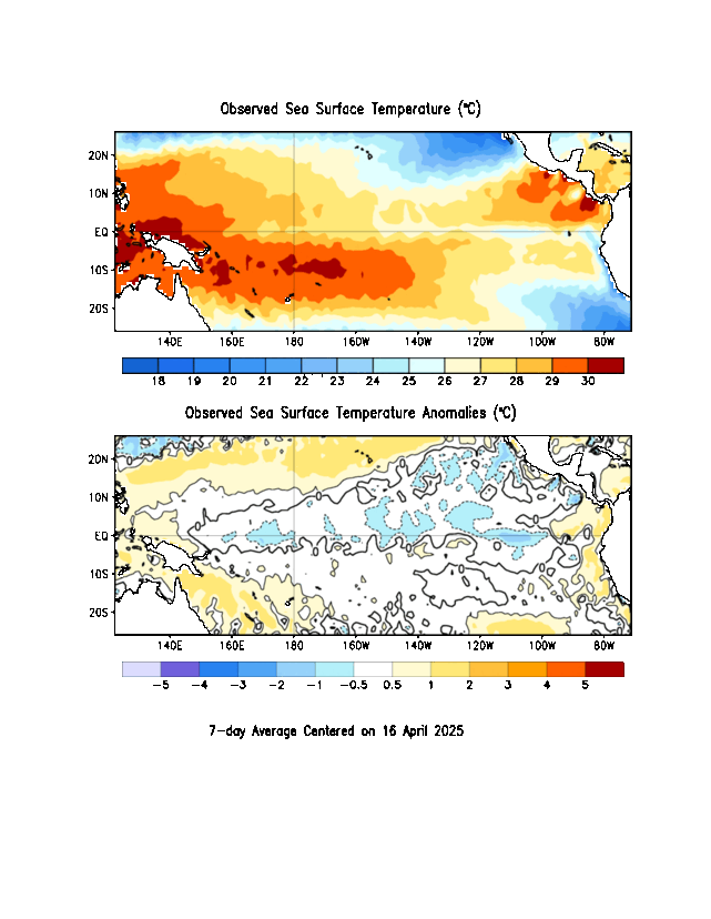
We can look at what happened in past El Nino winters to get a good idea of what might happen this year. For instance, here is a map showing the average precipitation anomalies in November through March of El Nino years from NOAA ESRL:

We see that during El Nino years, California has usually been much wetter than normal, as has the Gulf Coast. Interestingly enough, El Nino tends to suppress Atlantic hurricanes, so the extra rain on the Gulf Coast is NOT due to more tropical cyclones---just a rainier winter pattern. Where does El Nino mean drier conditions? Here in the Pacific Northwest, it seems, and also to some extent in the Midwest.
But wait...here's another map from the Climate Prediction Center that is supposed to show *almost* the same thing. The upper left panel of this figure claims to show precipitation anomalies for December through February of major El Nino years:

Some features are very similar---we still see the increased precipitation in California, along the Gulf Coast and up the eastern seaboard. But note the Pacific Northwest---here we see the opposite connection: significantly wetter than normal during El Nino years! How can these two maps give such different results?
There are a couple of things that are different. One is that the first map gives anomalies for Nov. through March whereas the second gives anomalies for Dec. through Feb. But, there is a significant degree of overlap between the two (and actually looking at other maps from the CPC that include Nov. and March show the same "wetter" pattern).
Another is the number of cases used. Both plots list the years that they used to make these composite averages. The first uses what looks like only nine winters, while the second uses 22. Looking at the strength of the El Nino events in these years, the second plot uses several weaker El Nino events not included in the first one. So that could affect things.
We also have to pay attention to the different baselines used for making these plots. Remember these plots are showing average departure from normal. But what is "normal"? In the top plot, they say that they are comparing to the 1971-2000 average. In the second plot (if you find it on the CPC website), they are using a 1981-2010 average. So both maps have a different view of what is "normal". I pulled the NCEP reanalysis data for precipitation and plotted up the average Dec. - Feb precipitation for both 1971-2000 and 1981-2010. Here's a map of the percent change between the two:

In this plot, blue means the average precipitation was higher in 1981-2010 than in 1971-2000 while red means it was lower. Over the Pacific Northwest there's not much of a difference. The later time period may be slightly drier, which could maybe a explain a little bit of why the El Nino anomalies from the second plot showed it more likely to be wetter in El Nino years. But it doesn't look like a big enough change to account for the differences we saw in the above plots.
So the differences probably come down to the second point---using different years for the composite. We probably don't really have enough samples to reliably draw a connection between El Nino years and what happens for Pacific Northwest precipitation during the winter. It seems that in very strong El Nino years (as this one looks like it might be), we may tend to be drier than normal, as seen in the first plot. But, as we include weaker El Nino years (the second plot), the signal becomes more muddled and can actually show the opposite.
One thing both of the above sources agree on, though, is warmer than normal temperatures during El Nino winters in the Pacific Northwest. Probably not so good if you're looking to ski...
Though these anomalies are strongest during the winter months, we're already starting to see early signs that our precipitation patterns are beginning to look El Nino-like (even though we're still definitely in the summer). Here are the most recent 90-day precipitation anomalies:
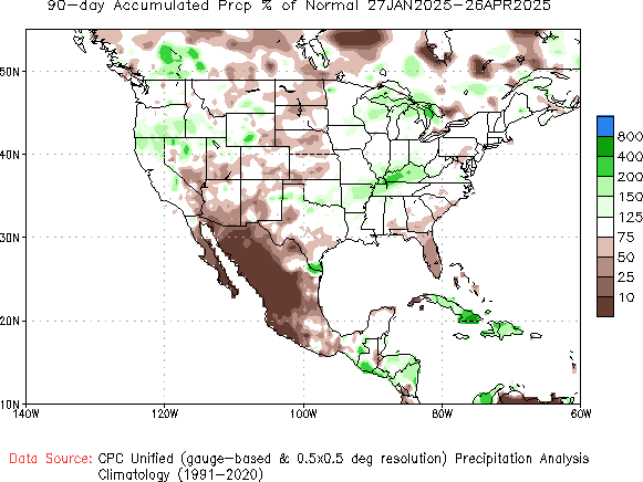
Wet in southern California and also into the southern Plains. Not so much of a signal on the Gulf Coast, but, then again, it still is summer...