Showing posts with label climate. Show all posts

Wednesday, November 18, 2015

Very Un-El-Nino-Like cold next week for the NW

The GFS ensemble (and the ECMWF ensemble as well) are showing a large pattern shift to highly-amplified flow coming by the end of this weekend and into next week over the western US.  This would represent a pretty stark change from the weather we've been experiencing here (which has been wet, but not unseasonably so).  Let's look at what this change means.

I apologize for the somewhat ugly graphics, but here's a "spaghetti plot" of two 500mb height contours from the GFS ensemble.  There are 21 ensemble forecasts here of 500mb height and each line represents a different forecast's idea of where that particular contour will be.  The cyan color is the 5520m line and the red color is the 5820m line.  Let's focus on the cyan lines for now.  This is a 96 hour forecast for 00Z Sun (so, Saturday evening in local time) showing a very zonal (east-west) pattern over then north Pacific.  This is more or less what we've been seeing for the last week or two.  There have been some wiggles along this line as shortwave troughs have come through (bringing us all that rain), but the mean pattern has been rather flat like this.
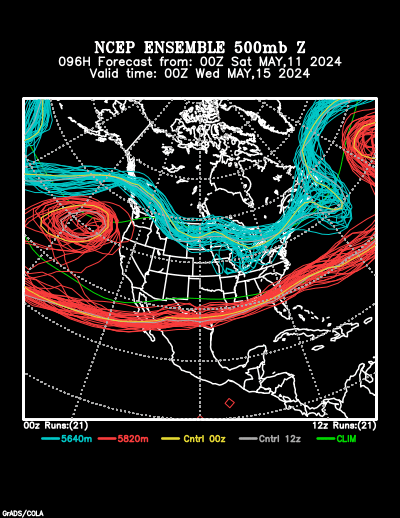
NCEP Ensemble forecast product

Fast forward three days to 00Z Wed (Tuesday evening).  We can see over the northwest that the pattern is very different.  Though there is some (a lot) of uncertainty as to the exact structure here, most of the ensemble members agree that a large ridge will amplify into the Gulf of Alaska with a deep trough digging down into the western US.
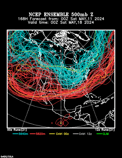
NCEP Ensemble forecast product

This signal has gotten rather robust in the last few runs.  What does this mean for our weather?  Cold.
The Climate Prediction Center (CPC) has caught on to this pattern change and their longer-term temperature forecasts show it.  Below we see the CPC forecasts with high probabilities of below-normal temperatures for the 6-10 day and the 8-14 day timeframes throughout the northwestern quarter of the continental US.  There's also a high probability of above-normal temperatures in Alaska associated with that high-amplitude ridge.
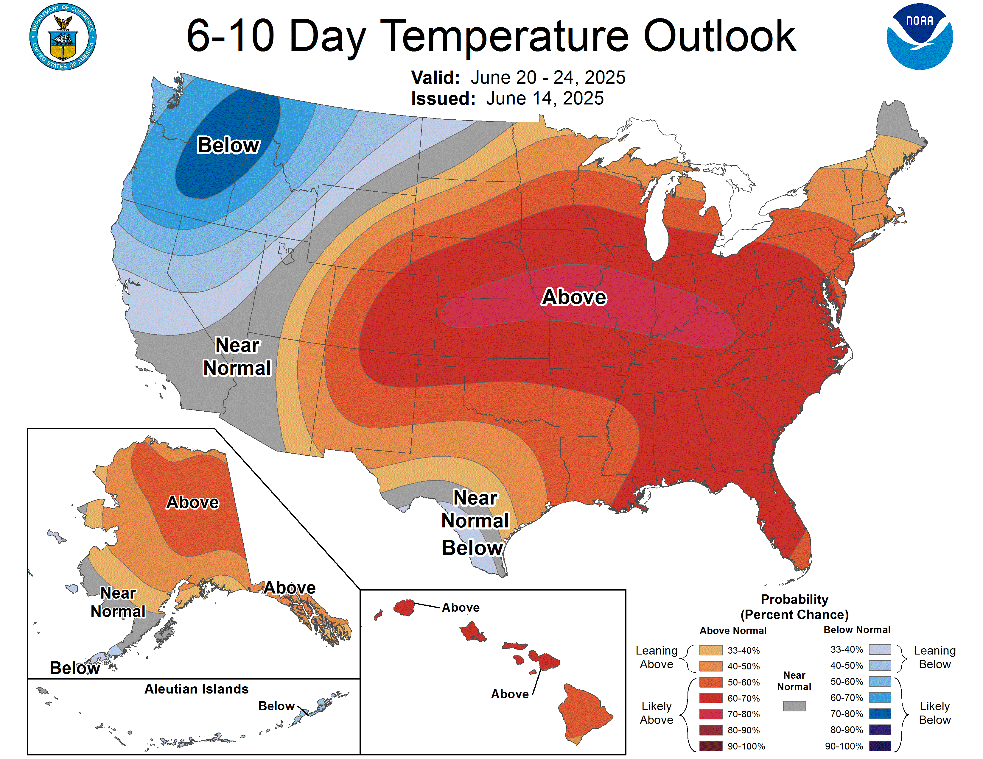
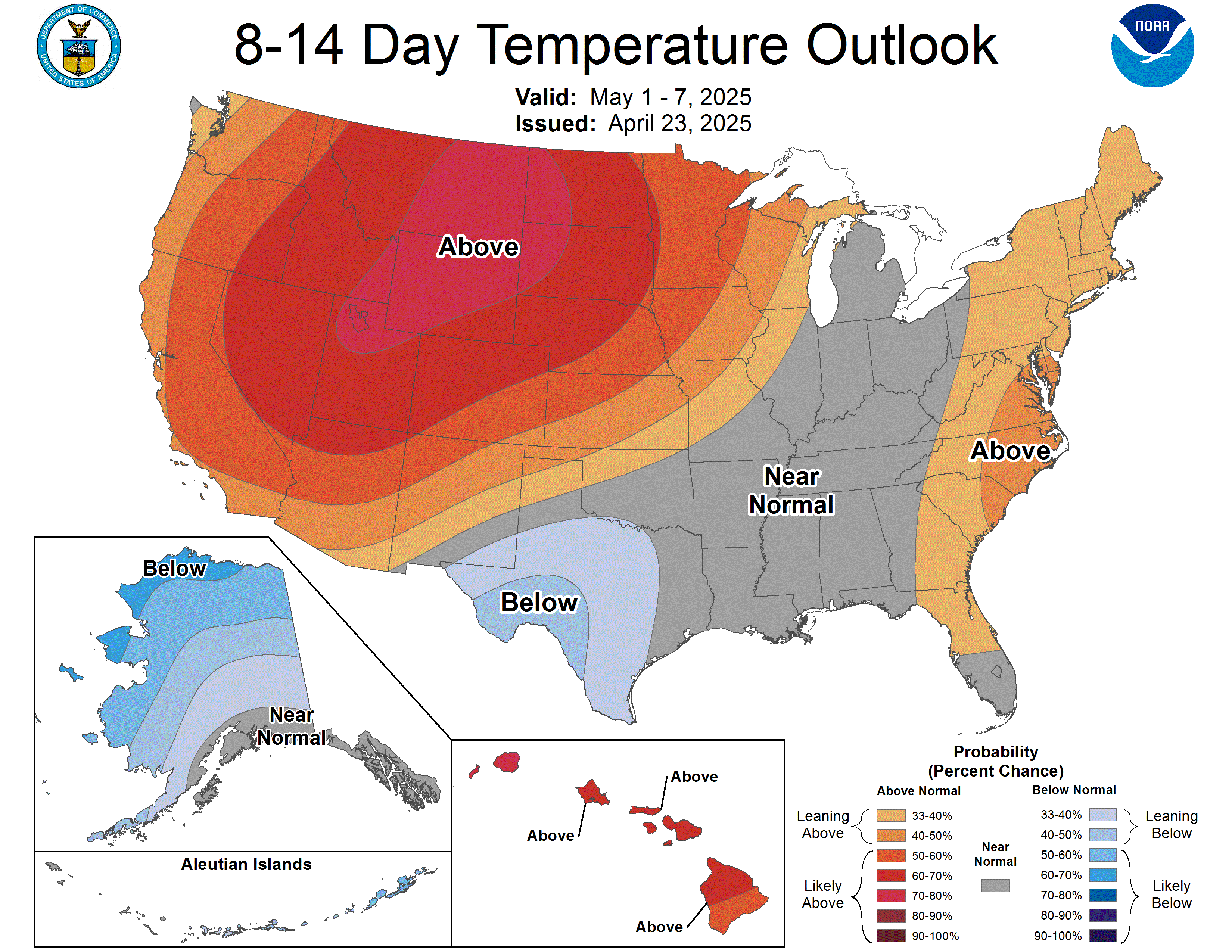
And, yet, we are in an El Nino year...a very strong El Nino year at that.  One of the things that seasonal forecasters have tried to bank on over the years in the more "robust" patterns in temperature and precipitation that seem to accompany El Nino events.  You'll note that the three-month outlook from the CPC shows what is the more canonical El Nino-type pattern, that being warmer temperatures in the Northwest and across the northern tier of the country.
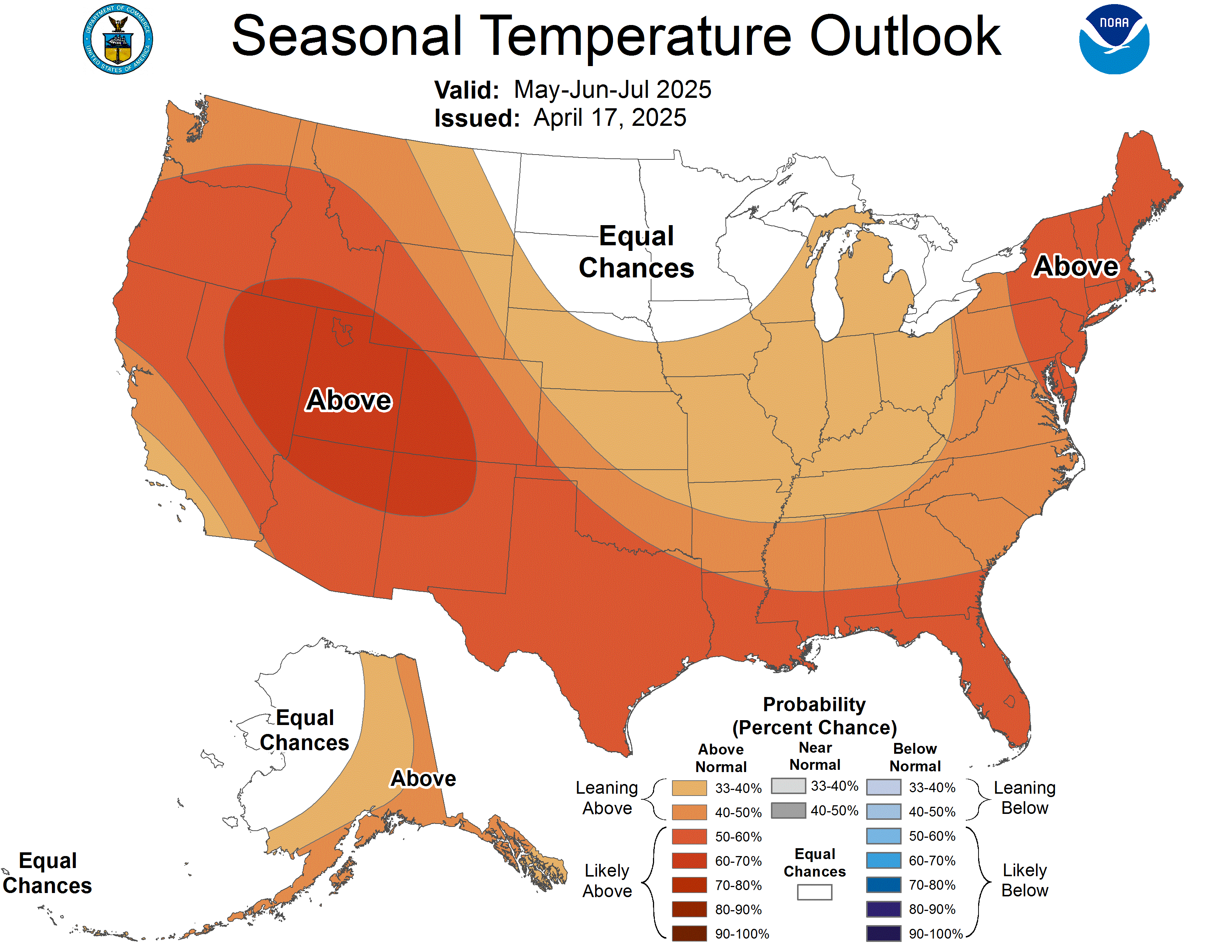
So this is coming as a surprise to a lot of people who had been expecting a warmer-than-average winter.  Does this mean everything we understood about what El Nino does is wrong?  Not at all...this troughing pattern will probably end up being transient as most weather signals are.  We may have a week or so of colder temperatures, but at this point it seems unlikely that this deep trough will be the story of the winter.  Remember that when we get toward monthly and seasonal scales we're getting into the realm of climate, where the El Nino patterns are more applicable.  Just because on average we expect warmer temperatures doesn't mean we can't get super-cold for a few days.

This could be quite the cold snap, though.  If we look at a single model (the University of Washington extended WRF run) we can get an idea of one possibility for how cold the temperatures may be.  Here's the extended forecast for 850mb temperatures (which are a few thousand feet above sea level) for next Wednesday at 12Z.  The light blue line is the 0 Celsius line (32 Fahrenheit), which you can see dipping all the way into southern California.  Remember this is at 850mb, so this is a few thousand feet up.  Still impressive.
Actual temperatures at the surface aren't as bad, but still showing below freezing (in the 20s) on Wednesday morning in western Washington.

Temperatures like that would be cold enough for lowland snow in western Washington, which only tends to happen about once a year (at best).  That assumes we get moisture, and there is a fair chance of that.  This forecast will definitely be something to watch develop this weekend.

Tuesday, August 4, 2015

El Nino and Precipitation--Depends on Who You Ask

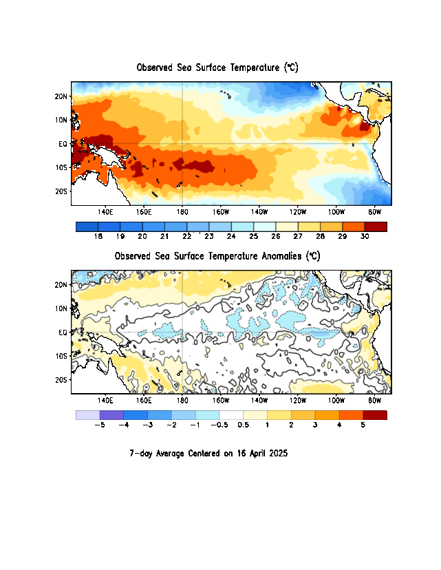
I came across an interesting divergence in opinion on what the impacts of El Nino on wintertime weather here in the Pacific Northwest might be.  First, a reminder that El Nino conditions are present in the Pacific Ocean.  Here are the latest weekly sea-surface temperatures, with anomalies on the bottom.  The next several images are from the Climate Prediction Center's ENSO page.
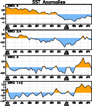
It's a classic El Nino signature with a tongue of warmer-than-average sea-surface temperatures stretching westward along the equator from western South America.  One way we often track the strength of El Nino over time is to look at something called the Nino 3.4 index, which is basically the average sea-surface temperature anomaly in the central Pacific.  Here's what that index has looked like over the past year.  The Nino 3.4 index is the second panel from the top.
Positive Nino 3.4 values indicate warmer than normal sea-surface temperatures.  Since about mid-March of this year, the Nino 3.4 index has been climbing steadily, now up to near 1.7.  Anything above 1.0 is considered an El Nino event, so this is definitely a legitimate, full-blown El Nino.

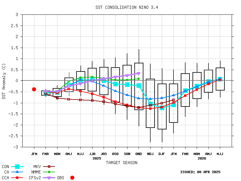
We have dynamical and statistical models that try to forecast what the Nino 3.4 index will be like for the coming months.  Here are those model projections, though they are almost a month old:
These forecasts are for three month periods, given by the letter abbreviations at the bottom on the x-axis.  You can see that by the late fall into winter (around the OND, NDJ, and DJF time) the Nino 3.4 index is predicted to peak.  There's a lot of spread, but the average maximum is between 2.0 and 2.5.  Keep in mind that the 1997-1998 El Nino event---the largest we have on record---peaked at a Nino 3.4 value of 2.3.  It's definitely possible for us to meet or beat that strength...

One of the major reasons we care so much about El Nino is that it is one of the few phenomena that can give us information about what the large-scale weather patterns will be like months in advance.  We've gotten rather good at synoptic-scale weather prediction, with forecasts good out to 10 days or so.  We also feel we have a reliable handle on large-scale climate impacts on the scale of years to decades.  But it's that in-between area---regional variability in large-scale weather patterns on the orders of weeks to months---where we really don't have much predictive skill.  Thus, anything that can give us a signal as to what may happen in that time frame is highly valued, and El Nino is the best tool we have.

We can look at what happened in past El Nino winters to get a good idea of what might happen this year.  For instance, here is a map showing the average precipitation anomalies in November through March of  El Nino years from NOAA ESRL:

We see that during El Nino years, California has usually been much wetter than normal, as has the Gulf Coast.  Interestingly enough, El Nino tends to suppress Atlantic hurricanes, so the extra rain on the Gulf Coast is NOT due to more tropical cyclones---just a rainier winter pattern.  Where does El Nino mean drier conditions?  Here in the Pacific Northwest, it seems, and also to some extent in the Midwest.

But wait...here's another map from the Climate Prediction Center that is supposed to show *almost* the same thing.  The upper left panel of this figure claims to show precipitation anomalies for December through February of major El Nino years:

Some features are very similar---we still see the increased precipitation in California, along the Gulf Coast and up the eastern seaboard.  But note the Pacific Northwest---here we see the opposite connection: significantly wetter than normal during El Nino years!  How can these two maps give such different results?

There are a couple of things that are different.  One is that the first map gives anomalies for Nov. through March whereas the second gives anomalies for Dec. through Feb.  But, there is a significant degree of overlap between the two (and actually looking at other maps from the CPC that include Nov. and March show the same "wetter" pattern).

Another is the number of cases used.  Both plots list the years that they used to make these composite averages.  The first uses what looks like only nine winters, while the second uses 22.  Looking at the strength of the El Nino events in these years, the second plot uses several weaker El Nino events not included in the first one.  So that could affect things.

We also have to pay attention to the different baselines used for making these plots.  Remember these plots are showing average departure from normal.  But what is "normal"?  In the top plot, they say that they are comparing to the 1971-2000 average.  In the second plot (if you find it on the CPC website), they are using a 1981-2010 average.  So both maps have a different view of what is "normal".  I pulled the NCEP reanalysis data for precipitation and plotted up the average Dec. -  Feb precipitation for both 1971-2000 and 1981-2010.  Here's a map of the percent change between the two:

In this plot, blue means the average precipitation was higher in 1981-2010 than in 1971-2000 while red means it was lower.  Over the Pacific Northwest there's not much of a difference.  The later time period may be slightly drier, which could maybe a explain a little bit of why the El Nino anomalies from the second plot showed it more likely to be wetter in El Nino years.  But it doesn't look like a big enough change to account for the differences we saw in the above plots. 

So the differences probably come down to the second point---using different years for the composite.  We probably don't really have enough samples to reliably draw a connection between El Nino years and what happens for Pacific Northwest precipitation during the winter.  It seems that in very strong El Nino years (as this one looks like it might be), we may tend to be drier than normal, as seen in the first plot.  But, as we include weaker El Nino years (the second plot), the signal becomes more muddled and can actually show the opposite.

One thing both of the above sources agree on, though, is warmer than normal temperatures during El Nino winters in the Pacific Northwest.  Probably not so good if you're looking to ski...

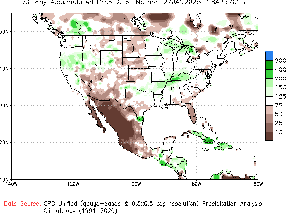
Though these anomalies are strongest during the winter months, we're already starting to see early signs that our precipitation patterns are beginning to look El Nino-like (even though we're still definitely in the summer).  Here are the most recent 90-day precipitation anomalies:

Wet in southern California and also into the southern Plains.  Not so much of a signal on the Gulf Coast, but, then again, it still is summer...

Friday, April 24, 2015

Volcanic Eruptions and Climate

Many people have been awestruck by the amazing images and video coming out of Chile this week, where the Calbuco volcano has dramatically erupted.  Here's an example I lifted from weather.com:
(David Cortes Serey/AFP/Getty Images)
The dramatic ash plumes from multiple eruptive phases have been visible on satellite, as these blog posts from the CIMSS satellite center illustrate.
This eruption has been throwing a lot of ash into the air and undoubtedly is emitting a lot of gasses, including greenhouse gasses like carbon dioxide, and producing suspended particles like sulfate aerosols.  These emissions can noticeably alter global temperatures if the eruption is large enough and in the right place.  How does this work?  And is the Calbuco eruption enough to change our climate trajectory?

You might think that by emitting a lot of carbon dioxide, the effect of a large volcanic eruption would be to warm the planet on average since, after all, carbon dioxide is a greenhouse gas.  However, even if you sum up all of the carbon dioxide emissions from all the volcanoes on earth, it is relatively small compared to other sources of carbon dioxide (like human beings).  Using USGS estimates, global volcanic emissions of CO2 amount to an average of 0.26 gigatons of carbon per year.  In comparison, just cars and trucks alone are estimated to emit 3.0 gigatons of carbon per year.  The EPA estimates total global human emissions of carbon to be some 32 gigatons of carbon per year.  What about a single BIG volcanic eruption?  That same USGS page has an estimate of the carbon emissions from the Mount Pinatubo eruption in 1991, one of the largest eruptions in recent history.  Their estimated emissions from that single eruption amount to 0.05 gigatons---much smaller than human emissions.  As such, we really can't detect any warming due to volcanic emissions...

In fact, we tend to see strong cooling of the atmosphere in the years following a large eruption.  Here's a reconstruction of the global mean temperature from the Berkeley Earth group, using mostly direct weather observations.
Their estimates get very noisy before the early 1800s because we had very few weather observations globally at that time.  You can also see a dark line on top of their fit, which is an estimate of the global mean temperature including only two things to force it: carbon dioxide changes and volcanic eruptions.  They've identified several of the larger eruptions that had a noticeable impact on the temperature.  Note that these eruptions are associated with sharp spikes in the temperature.  For a period of a few years after each eruption, the global temperature cooled.  Why is that?

It mainly has to do with another big emission from volcanoes---sulfur dioxide, which undergoes chemical reactions in the atmosphere to produce sulfate aerosols.  Sulfate aerosols are very good reflectors of solar radiation, so when they get lofted high up into the atmosphere, they reflect away some of the incoming sunlight.  This, in turn, leads to a temporary cooling of the earth's surface below while those aerosols are up there.  There are a number of other ways in which these aerosols affect the climate, but this reflection is one of the big ones.

Which brings us to another question---if volcanoes emit a lot of sulfur dioxide, why do only some volcanoes seem to have this big effect on climate and others don't?  Not all volcanic eruptions are created equal---some just emit more sulfur than others.  But location of the eruption also plays a big role.  I've plotted a map of the locations of all the eruptions listed in the above figure and a few others for reference.

On that map, the red triangles are the locations of eruptions that are known to have produced significant global cooling.  Notice anything about their locations?  They are all located in the tropics, between 20 degrees south and 20 degrees north.  It turns out that large tropical volcanic eruptions are more likely to produce cooling on the earth's surface.

To get a prolonged period of cooling, you have to get the sulfur lofted high enough into the atmosphere, you want it to cover a relatively large area of the globe, and you want it to stay there for a long period of time.  Volcanoes are typically capable of lofting emissions into the stratosphere, which is high enough for them to be effective at reflecting incoming sunlight and staying aloft a long time (i.e., they're lofted above the dynamic weather systems and thunderstorms that could efficiently "rain out" all of the sulfur).  The stratosphere has its own circulation, called the "Brewer-Dobson Circulation".  It's actually a fairly simple arrangement:
Deep, persistent tropical convection below helps lead to rising motion in the tropical stratosphere.  This air then slowly moves north and south, away from the equator, and then sinks again in the mid to upper latitudes.  The entire process is somewhat slow, taking a couple years to fully cycle.

So, if you wanted to inject sulfur into the stratosphere in a place where you would know that it would be lifted up high, spread out across the globe and stay there for a few years, you would want it to be injected in the tropics.  In the mid to upper latitudes, the general motion in the stratosphere is downward, so it would be hard for any injected sulfur to spread out much or stay aloft for very long.  This is why large tropical eruptions usually produce the biggest impact on climate.

Occasionally an extratropical volcano can make a difference.  Note in the temperature record above there was a strong response to the Laki volcano in the late 1700s.  Now, the Laki volcano is in Iceland, well away from the tropics.  Why does it show such a large impact?  For one, those temperature records are based on where we had instruments, and in the late 1700s that was mostly in Europe which is directly downstream from the Laki volcano.  Still, the effect was significant and felt across the northern hemisphere, including in the United States.  One difference is that the Laki eruption was very long in duration---it erupted nearly continuously for eight months.  That's a long time to be pumping sulfur into the atmosphere, regardless of where it's being emitted.  So it is possible for an extratropical volcano to have an observable, long-term effect, but it doesn't happen often.

Which brings us back to the Calbuco eruption this week.  Calbuco is at 41 degrees south latitude, well outside the tropics.  It's worth noting that other nearby volcanoes that have erupted in recent years (like Villarica and Caulle Cordon) have not caused observable global temperature decreases; their emissions mainly stayed in the far Southern Hemisphere. So, it's unlikely we'll see a global temperature change due to this eruption, but it's still fascinating to watch.