Showing posts with label cold air outbreak. Show all posts

Wednesday, November 18, 2015

Very Un-El-Nino-Like cold next week for the NW

The GFS ensemble (and the ECMWF ensemble as well) are showing a large pattern shift to highly-amplified flow coming by the end of this weekend and into next week over the western US.  This would represent a pretty stark change from the weather we've been experiencing here (which has been wet, but not unseasonably so).  Let's look at what this change means.

I apologize for the somewhat ugly graphics, but here's a "spaghetti plot" of two 500mb height contours from the GFS ensemble.  There are 21 ensemble forecasts here of 500mb height and each line represents a different forecast's idea of where that particular contour will be.  The cyan color is the 5520m line and the red color is the 5820m line.  Let's focus on the cyan lines for now.  This is a 96 hour forecast for 00Z Sun (so, Saturday evening in local time) showing a very zonal (east-west) pattern over then north Pacific.  This is more or less what we've been seeing for the last week or two.  There have been some wiggles along this line as shortwave troughs have come through (bringing us all that rain), but the mean pattern has been rather flat like this.
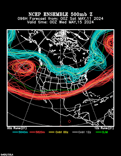
NCEP Ensemble forecast product

Fast forward three days to 00Z Wed (Tuesday evening).  We can see over the northwest that the pattern is very different.  Though there is some (a lot) of uncertainty as to the exact structure here, most of the ensemble members agree that a large ridge will amplify into the Gulf of Alaska with a deep trough digging down into the western US.
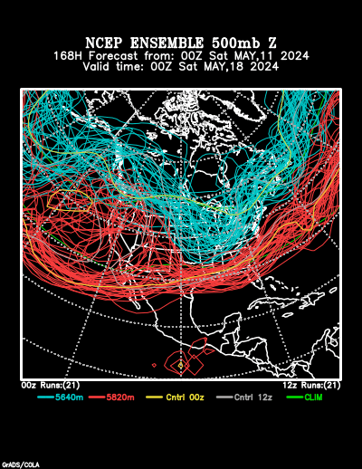
NCEP Ensemble forecast product

This signal has gotten rather robust in the last few runs.  What does this mean for our weather?  Cold.
The Climate Prediction Center (CPC) has caught on to this pattern change and their longer-term temperature forecasts show it.  Below we see the CPC forecasts with high probabilities of below-normal temperatures for the 6-10 day and the 8-14 day timeframes throughout the northwestern quarter of the continental US.  There's also a high probability of above-normal temperatures in Alaska associated with that high-amplitude ridge.
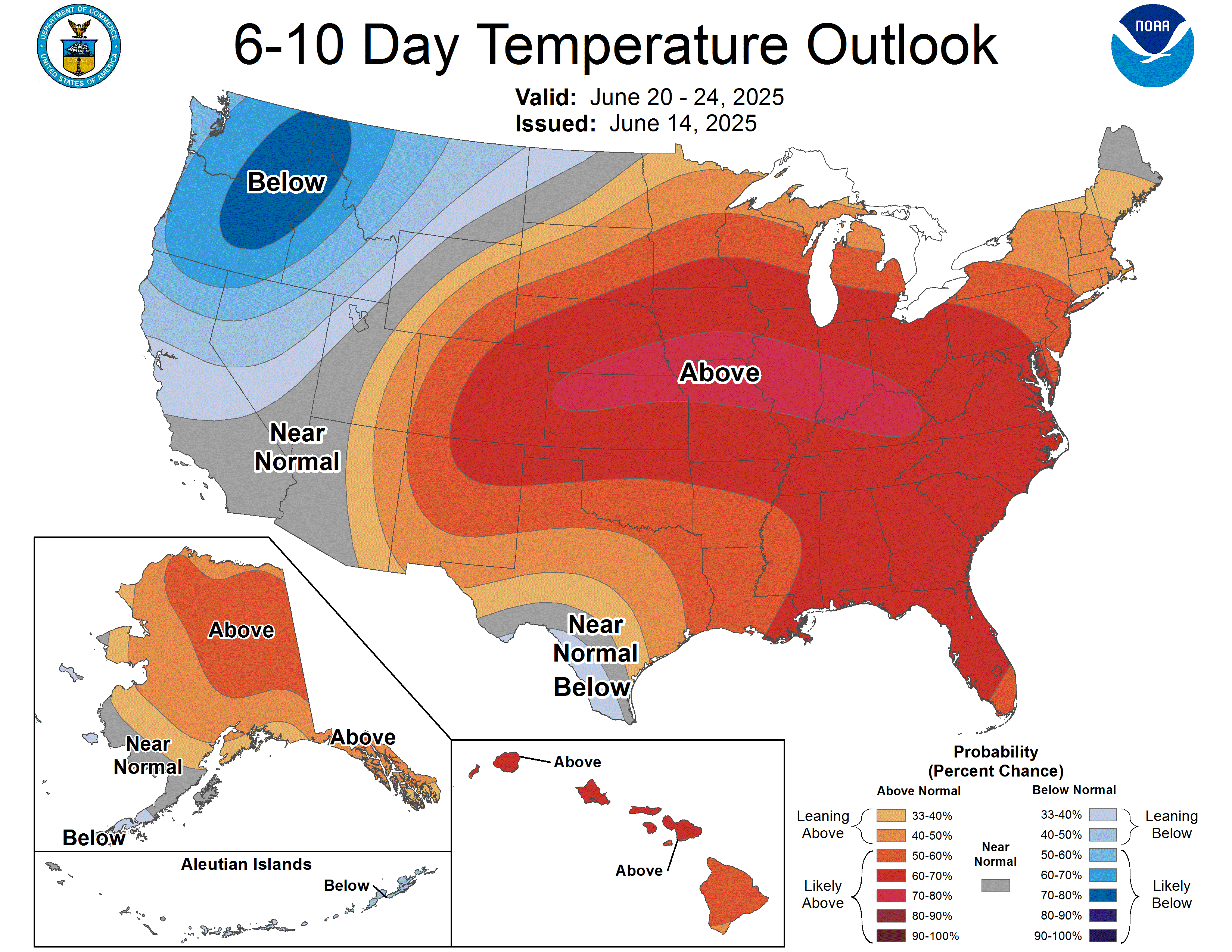
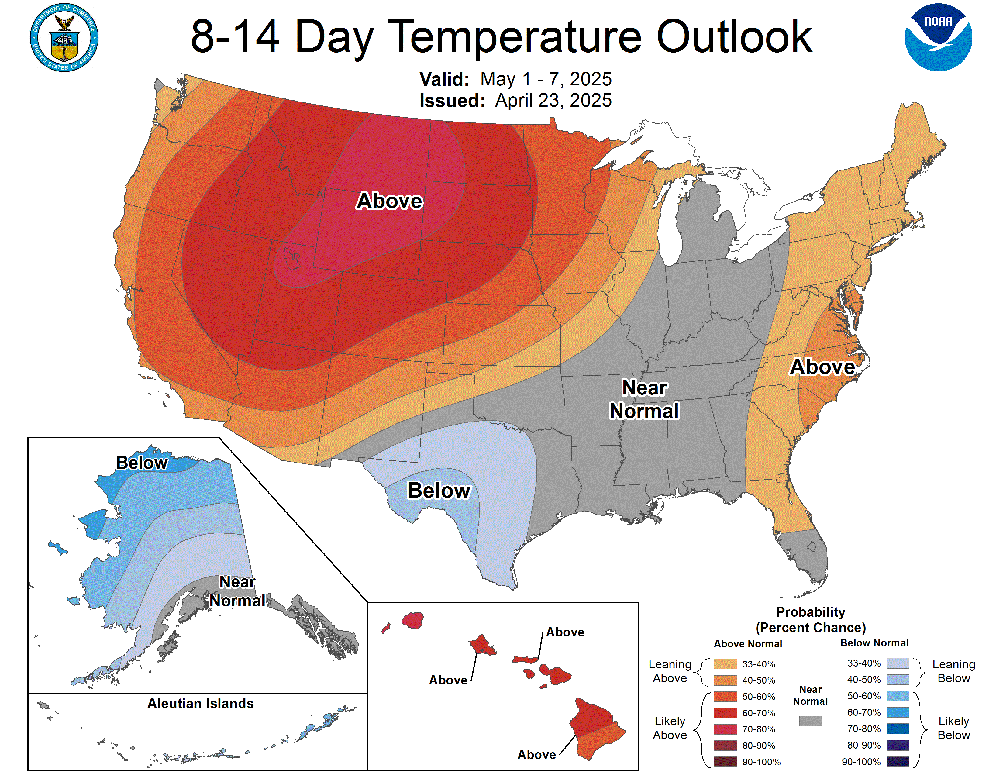
And, yet, we are in an El Nino year...a very strong El Nino year at that.  One of the things that seasonal forecasters have tried to bank on over the years in the more "robust" patterns in temperature and precipitation that seem to accompany El Nino events.  You'll note that the three-month outlook from the CPC shows what is the more canonical El Nino-type pattern, that being warmer temperatures in the Northwest and across the northern tier of the country.
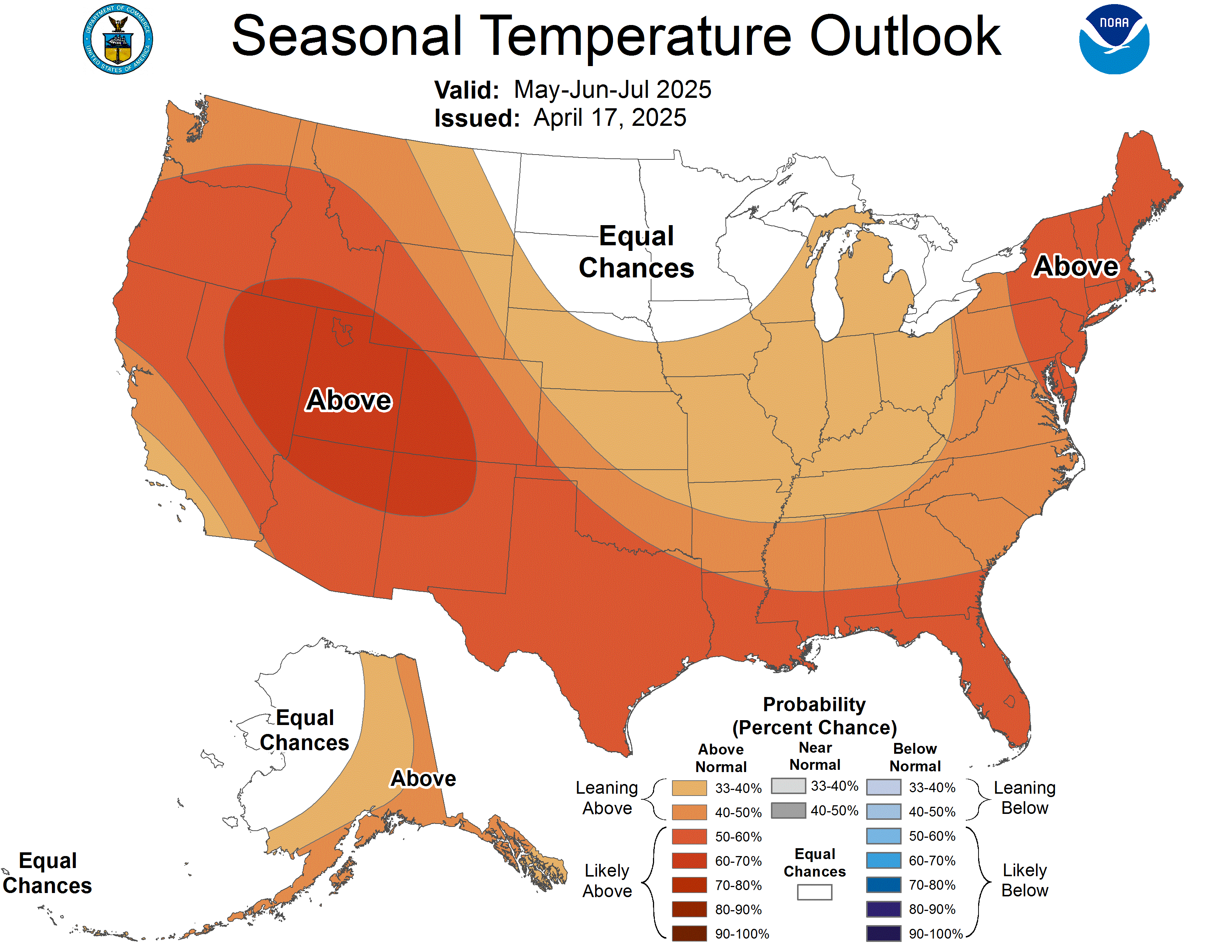
So this is coming as a surprise to a lot of people who had been expecting a warmer-than-average winter.  Does this mean everything we understood about what El Nino does is wrong?  Not at all...this troughing pattern will probably end up being transient as most weather signals are.  We may have a week or so of colder temperatures, but at this point it seems unlikely that this deep trough will be the story of the winter.  Remember that when we get toward monthly and seasonal scales we're getting into the realm of climate, where the El Nino patterns are more applicable.  Just because on average we expect warmer temperatures doesn't mean we can't get super-cold for a few days.

This could be quite the cold snap, though.  If we look at a single model (the University of Washington extended WRF run) we can get an idea of one possibility for how cold the temperatures may be.  Here's the extended forecast for 850mb temperatures (which are a few thousand feet above sea level) for next Wednesday at 12Z.  The light blue line is the 0 Celsius line (32 Fahrenheit), which you can see dipping all the way into southern California.  Remember this is at 850mb, so this is a few thousand feet up.  Still impressive.
Actual temperatures at the surface aren't as bad, but still showing below freezing (in the 20s) on Wednesday morning in western Washington.

Temperatures like that would be cold enough for lowland snow in western Washington, which only tends to happen about once a year (at best).  That assumes we get moisture, and there is a fair chance of that.  This forecast will definitely be something to watch develop this weekend.

Monday, January 6, 2014

An analog context for the cold wave

Much of the country is experiencing some of the coldest weather it has seen in many years this week with temperatures struggling to get above zero Fahrenheit and wind chills in the frigid -50 to -60 degree range in some places.  Here's this morning's surface temperature analysis:
Somewhat complicated plot, but I like it because it nicely divides the above freezing (red) and below freezing (blue) temperatres by the color of the contours, giving an idea of the extent of the cold air.  You can see the strong cold front that has been pushing through the eastern United States today as it trails behind a low pressure center that was over southern Ontario this morning.  Frigidly cold temperatures.  This air has been travelling rapidly down from the arctic over the past several days.  Here's a plot showing the air trajectories over the past three days for parcels of air in the lowest 1km of the atmosphere.  You can see that they have been travelling all the way from the Arctic Ocean down to the midwest.

One notable feature of this air transport is that it has been relatively slow to warm up as it plunged south.  The bottom panel of that plot shows the temperature of this air (in Kelvin) as it has moved along (it's read from right to left with the left side being last night).  Some warming of the air has come because the air has descended a bit.  But in terms of sensible temperature it has only maybe warmed about 10 F (difficult to estimate) over its entire journey.  Part of this is because it has traveled over an area that is now entirely covered by snow, keeping the low-levels of the atmosphere relatively cold.  Here's the latest snow depth estimate map from the National Operational Hydrologic Remote Sensing Center (NOHRSC):

You can rest assured that most of northern Canada has a solid snow pack too.  All of this snow worked like kind of a refrigerator, keeping that cold air cold as it moved south.

We can see this cold air mass nicely outlined by looking at the temperatures above the surface.  Just above the surface at 850mb we see from this morning's NAM analysis that we had -30 to -35 Celsius temperatures over the upper midwest:
When is the last time we had temperatures this cold?  One ever-developing tool in meteorology is the ability to search for analogs--that is, to find example patterns of atmospheric conditions in the past that are very similar to what we are experiencing now or expecting in the forecast.  The cold wave of January 1994 is a good analog for our current cold weather outbreak, though that cold wave was a bit longer in duration.  Here's an example of the 850mb temperatures from the middle of that event:
A similar pool of very cold air over the upper midwest.  That's -36 degrees Celsius over northern Wisconsin and Minnesota.  Wikipedia's brief page about this event has some of the following nuggets of trivia:

  • Chicago got down to -21 Fahrenheit with wind chills down to -55
  • Major snowfalls across the eastern half of the US
  • Reagan National Airport in DC had a record low high temperature (for the 20th Century) of 8 Fahrenheit
  • Pittsburgh got down to a record low -22 Fahrenheit
Do these headlines sound at all familiar?  Maybe it's because we're seeing something similar again:
  • Chicago got down to -17 Fahrenheit this morning with wind chills down to -42 Fahrenheit
  • The 11 inches of snow that has fallen in Chicago is the most in a single event since 2011
The bulk of the coldest air is just moving into the eastern part of the US right now.  Given how similar this event seems to be to the 1994 case, we might therefore by analog expect these kind of chilly temperatures for DC and Pittsburgh later. It doesn't look like we'll get as cold---DC is forecast to have a high of 17 tomorrow and Pittsburgh is only forecast to fall to -10---but still, this gives us an idea of what to expect.

Another side of this kind of analog forecasting is that we can use it to try and describe more abstract effects of the weather on lives and property.  Trying to describe the societal impacts of weather is something that the meteorological community still struggles to do well.  We can give you all the numbers you want for how cold it is going to get or how strong the winds will blow, but what does that mean for peoples' health and safety?  We've developed some systems to try and address this---the Saffir-Simpson Hurricane Scale, for instance, relates the wind speed of a hurricane to the type of damage we might expect from such a storm.  But we don't have these kinds of scales for everything and they are not perfect.

By looking at past analogs, we can get an idea of what we could expect based on what happened last time.  For instance, during the cold of January 1994, over 100 people died due to consequences of the cold weather.  Quoting from that Wikipedia article, United cancelled over half its flights, pipe explosions due to freezing cut off water to thousands of homes, Chicago schools closed, and hundreds of drivers in Chicago could not start their cars due to the cold.

What do we have right now?  O'Hare is backed up for four days to get flights out due to cancellations from the snow and cold, Chicago's schools are closed...we'll have to wait to see how many people suffered from exposure or lost their utilities.  My point is that by using analog forecasting we can get a hint of the kinds of consequences of the weather that our models cannot predict by turning to past experiences.  This is a powerful forecasting tool that is only beginning to be exploited...

Friday, February 10, 2012

A really big high brings winter back

A lot of snow and rain is currently impacting the eastern third of the country.  This morning's radar composite sums it up nicely.
Heavy rain for southern Louisiana with scattered heavy showers throughout the southeast.  Further north where it's colder, snow (enhanced by the lake effect) is being reported in the Chicago area and northern Michigan.

All this active weather...but where is the surface low?  Here was this morning's 12Z GFS surface analysis:
The only really organized center of low pressure is analyzed well to the northeast in eastern Quebec.  There is, however, a general trough of low pressure extending back through the Great Lakes and down into the southern plains.  This trough looks to be simply a consequence of being caught between two high pressure centers--one weaker high off the Carolina coast, and another, stronger, sprawling high pressure center in the Canadian Prairies.  Notice the very cold temperatures associated with this high pressure center--well below zero Fahrenheit a the surface this morning in parts of central Canada and the northern plains.  There's also a pretty sharp boundary between this colder air and slightly warmer air being pulled north in that low pressure trough. So, even in the absence of a strong surface low, we still have such a strong high pressure center that good enough thermal gradients are set up to help produce some significant weather.

This high pressure center looks to be here to stay--by tomorrow morning it is forecast to have set up shop in the central plains, bringing down much colder air than we've been seeing in the central and eastern US as of late.  Here's tomorrow morning's GFS forecast:

Notice the very strong temperature contrasts still on the leading edge of this high pressure center.  Furthermore, as this cold air moves down over the land surface, it encounters much warmer air over the open waters of the Gulf of Mexico and off the east coast.  This is setting up some very strong-looking temperature gradients that follow the coastline.  It also looks to be driving some cyclogenesis off the east coast.  Furthermore, with such a strong high pressure center, the pressure gradients are also very strong, and this means strong winds--you can see some 15-20 knot winds forecast over the upper Mississippi valley and into the southeast.  This means when the cold air arrives, it's going to arrive with quite the blast.

This high continues to linger into Sunday, according to the 48-hour GFS forecast:
Nos the strongest pressure gradients look to be across the middle Atlantic states.  Should be quite the blowdown.

With this huge high pressure center crashing the party, it looks like the weather pattern is finally turning to something more winter-like.  Seattle is once again back to having its rounds of rain with relatively cool weather, frigid temperatures are building back across the northern Plains, and with the presence of this high pressure center things look to dry out a bit from the rainier-than-normal conditions some places in the south and east have seen lately.  Perhaps these La-Nina-based seasonal predictions will come true after all...

Monday, September 12, 2011

Autumn starts crashing in

It's that time of year--time to start looking ahead to the cooler temperatures that are inevitably on their way.  A taste of more fall-like temperatures is due this week for much of the central part of the country.

Right now, we still have the same general upper-air pattern that I talked about a week ago--a ridge over the west with troughing in the east:
GFS analysis of 500mb heights and winds, 12Z, Sept. 12, 2011.
However, by mid-week, a relatively strong upper-level trough is forecast to dig down across western Ontario and into the upper Great Lakes.
GFS 54-hour forecast of 500mb heights and winds valid 18Z, Wed, Sept. 14, 2011.
Notice that for the first time in a while we have a really significant jet streak visible (the strong winds indicated by the bright colors) over the upper midwest.  This jet streak represents a particularly strong portion of the larger jet stream which circles the globe over the boundary between cold polar air to the north and warmer, subtropical-like air to the south. During the autumn in the US as the northern hemisphere begins to be pointed more away from the sun, cold polar air creeps slowly southward.  We see this manifested in the upper-air pattern as the polar jet stream also creeping slowly southward.  When we start seeing jet streaks (remember--these are embedded in the larger jet stream) over the northern US again, it's evidence that the jet stream is on its way south and cold polar air is soon to follow.

Sure enough, the GFS is forecasting a large high-pressure center to move down from Canada and settle over the middle of the country.  The air mass accompanying this high pressure center is continental and polar in origin, bringing with it cold air and clear skies.  Here are the forecast low temperatures on Thursday morning:
GFS 72-hour forecast of 2-meter temperature (colors), mean sea-level pressure (contours) and winds (barbs) valid 12Z, Thursday, Sept. 15, 2011.
This forecast shows low temperatures in the low 20s in parts of Minnesota--with lows in the 30s and low 40s also predicted for much of the midwest and northern plains.  You might also notice how the leading edge of the cold air has a rather distinct boundary--there is a pronounced wind shift along the leading edge as well as a strong temperature gradient.  These are the classic marks of a cold front, and we really haven't had a decently strong cold front move through the country in quite some time.  As this front moves south and encounters rich moisture, storms and rain along the front will probably be possible on Wednesday and Thursday.  The model forecast for Wednesday night would seem to confirm this:
GFS 60-hour forecast of 6-hour accumulated surface precipitation valid 00Z, Thursday, Sept. 15, 2011.
There's a fair amount of precipitation forecast right along that frontal boundary.

Is this unusually cold weather for this time of year?  Indeed it is.  Here's a plot of the climatological records and normals so far this year for Chicago:
2011 observed, normal, and record values so far as of Sept. 11, 2011.  From the NWS WFO Chicago.
In the top panel of the graph, the bottoms of the pale blue bars indicate the record low temperatures.  For mid-September, the record lows are around 40 degrees, and based on the forecast above it looks like we may get close to that.  So, an unusually chilly few nights are coming up this week.

Monday, January 31, 2011

Quick Comparison of This Event with the January 1999 Blizzard

In reading a lot of the forecast discussions from WFOs across the upper midwest, I noted several references comparing this coming winter weather event to the blizzard of January 2-4th, 1999.  Though I apparently lived right through the middle of it, I honestly didn't remember this particular event.  So, I thought I'd see what all this hubub was about and quickly, qualitatively compare the two events.

The initial synoptic setup is remarkably similar.  Take this morning's 12Z 500mb analysis from the GFS:
Fig 1 -- GFS 500mb geopotential height and wind analysis at 12Z, Monday, January 31, 2011.
Note the two features I noted in my last post that will combine to produce this powerful storm--a shortwave digging out of southern Alberta into nothern Montana and another in the desert Southwest over Arizona.  Compare this to an archived 500mb analysis from 12Z on Friday, January 1st, 1999.
Fig 2 -- NOAA Difax 500mb N. America geopotential height analysis from 12Z, Jan. 1, 1999. 
There are indeed some eerie similarities between the two analyses.  There were also two shortwaves analyzed before the 1999 storm, though these were slightly further east--one was coming out of southern Saskatchewan while the axis of the other was in New Mexico.  Though these features are slightly further east, the forecast for the current event will quickly catch this week's shortwaves up and even speed past the timing of the 1999 event.  But more on that later...

Back to this current event, twenty-four hours later (12Z on Tuesday morning), the GFS forecast has a well-defined, if somewhat east-west expansive, trough across the central part of the country with embedded short waves.
Fig 3 -- GFS 24-hour forecast of 500mb geopotential height and winds valid 12Z, Tuesday, February 1, 2011.
Comparing this to the 1999 event 24 hours later, we see that the analyzed 500mb trough didn't seem to have these embedded shortwaves and was more north-south oriented.  This is an important difference--the lack of tilt in the 1999 event slows down the progression of the trough and associated surface features.
Fig 4 -- NOAA Difax 500mb N. American analysis of geopotential height valid 12Z, Saturday, Jan. 2, 2011.
Even with these differences, however, both analyses feature at least some form of trough axis moving through central or eastern Texas with an attendant jet streak around the base of the trough.  Both of the exit regions of the jets would lie in the mid-Mississippi valley, enhancing the divergence aloft there.  But the timing and orientation of these two features is still different.  Here's the surface pressure forecast for the GFS at 12 hours later--00Z on this Tuesday night.
Fig 5 -- GFS 36-hour forecast of 500mb geopotential height and winds valid 00Z, Wednesday, February 2, 2011
Compare that to the surface analysis from the 1999 event at 24 hours later--12Z, Sunday, Jan. 3 1999.
Fig 6 -- NOAA Difax surface analysis valid 12Z, Sunday, Jan. 3, 1999.
BOTH analyses have a deep surface low located in the Memphis/southern Illinois region.  However, the GFS (and most of our other) model forecasts bring that low there a full 12 hours faster than the January 1999 event.  By the time we move the full 48 hours out in the GFS forecast for this current event, the low pressure center at the surface has already moved into Indiana and begun to occlude.
Fig 7 -- GFS 48 hour forecast of surface pressure and temperature valid 12Z, Wednesday, Feb. 2, 2011.
We don't see the occlusion on the 1999 storm until sometime before 72 hours out:
Fig 8 -- NOAA Difax analysis of surface pressure (and fronts) for 12Z, Jan. 4, 1999.
So by the time this low occludes, our current forecasts for the storm this week move things along 12-24 hours faster than the 1999 storm.

There are cold air intrusions in both events, however the observed 20-25 degree Fahrenheit morning lows in Oklahoma by the time of occlusion in the 1999 event are outstripped by the single-digit lows being forecast by the GFS for this week (NOT that we trust the GFS surface temperature forecasts...).  This hints at a stronger baroclinic zone and much colder air behind the front.  This becomes important because if we look at snowfall totals from the 1999 event--
Fig 9 -- NOAA Difax analysis of observed snowfall on the ground at 12Z, Jan.3, 1999.
--we see that while the upper midwest saw large amounts of snow (17 inches at O'Hare in Chicago on that list to the right...), the snow amounts taper off to the southwest.  Only a few inches were reported at places in Missouri and none in Oklahoma.  Contrast this with the blizzard warnings extending all the way into central Oklahoma with the event tomorrow--12-18 inches of snow are expected in parts of Oklahoma.  From this, we have to conclude that there is more moisture being forecast with the current event and/or the temperatures were colder further south, supporting more snow all the way into Oklahoma.

Interestingly, according to records at Wiley Post Airport in Oklahoma City, on January 2-3, 1999, snow and rain were both reported in the observations, but no measurable accumulation of either seems to be recorded.  The high temperature also hovered in the low to mid 30's with overnight lows in the low teens after the event. Not near the cold weather we're looking at according to current forecasts...

So, in conclusion, there are some general similarities in the evolution of both the 1999 blizzard and this week's event.  However, this week's storm will move much more quickly, have much colder air behind it, and bring wintry precipitation further south.  Up north, however, the proxy seems to be pretty good--if a storm of that intensity (and perhaps even more limited moisture) in 1999 could bring 17 inches of snow to Chicago, projections in that range would not seem to be out of the question for the upper midwest with this week's storm.

Finally (on a slightly technical note), I just want to leave with a cross-section image generated on the College of DuPage website from this evening's soundings.  This cross section runs from Albuquerque in the west to Nashville in the east.  We can see that "warm conveyor belt" starting to ramp up with that bulls-eye of moisture (the green contours) in an area of southerly winds to the east.
Fig 10 -- Cross section from Albuquerque, NM (left) to Nashville, TN (right) showing contours of potential temperature (red), mixing ratio (green), theta-e (yellow) and wind barbs valid at 00Z, Tuesday, Feb. 1, 2011.  From the College of DuPage website.
And so it begins...

Also, for all of you reading this at the University of Washington--I will be giving tomorrow's weather briefing in 310C at 12:30 PM and will be going into a fair amount of detail about this event during the presentation.  Feel free to come by...

Sunday, January 30, 2011

Two short waves, one big storm, Chicago blizzard?

It's been a week or so since I last posted on here.  The annual meeting of the American Meteorological Society was here in Seattle last week and needless to say I was very busy during that time.  But now that's done and my schedule can resume something more normal...

Today's National Weather Service summary map looks pretty spectacular:
Fig 1 -- NWS watches and warnings as of 2300Z, January 30, 2011.
The darker purple from Montana down through the high plains and into southern Wisconsin is all winter weather advisories.  The pinks through much of Missouri and eastern Kansas, Nebraska and Oklahoma are winter storm watches.  And what about that bright green blob surrounding Chicago?  That's a blizzard watch for the Chicago CWA.  Milwaukee is also issuing blizzard watches at this time.  I quote the following from Milwaukee's latest Winter Weather advisory:

"NEEDLESS TO SAY THIS COULD BE A HISTORIC BLIZZARD CAPABLE OF
PARALYZING PARTS OF SOUTHEAST WISCONSIN."

Pretty powerful words.  So what's the setup for this?

Right now, there is a highly amplified ridge over the west coast with broad scale troughing aloft across the eastern half of the country:
Fig 2 -- GFS 12Z analysis of 500 mb geopotential heights and vorticity on Jan 30, 2011.  From the HOOT website.
Note two individual shortwaves are evident in the west embedded in the larger-scale flow.  One is the nearly cutoff shortwave in southern Oregon and northern California.  The other is further north on the British Columbia/Alberta border in Canada.  This northern shortwave is located in the region we usually see "Alberta Clipper" type storms form.  It's somewhat unusual to have two shortwaves stacked on top of each other like that. Latest model forecasts show these two shortwaves merging together over the plains by late Tuesday:
Fgi 3 -- GFS 60 hour forecast of 500 mb geopotential height and vorticity valid 00Z, Wednesday, Feb. 2, 2011.  From the HOOT website.
Cold air in association with the northern shortwave is forecast to spill down into the plains as that shortwave moves south.  We can see a blob of colder temperatures moving down across the northern plains at 850mb on Monday:
Fig 4 -- GFS 30 hour forecast of 850mb temperatures and geopotential heights valid 18Z, Monday, Jan. 31, 2011.  From the HOOT website.  

Of course, there's already very warm air to the south in Texas and along the Gulf Coast.  As the cold air moves south, this is going to increase the temperature gradient across the central part of the country.  You can already see how quickly the 850mb temperature changes from Nebraska into Oklahoma on the image above.  This increasing temperature gradient means two things:

  1. Frontogenesis is going on at the low-levels--a cold front is most likely developing from Iowa down through Oklahoma at the time above.
  2. Based on those thermal wind arguments (yes, those again...), the increasing temperature gradients below translate to strengthening winds aloft parallel to the forming front.
Do we see winds increasing aloft in this area?  We do indeed see a jet streak strengthening in that area--and all the way back down into west Texas.
Fig 5 -- GFS 36 hour forecast of 300mb winds and geopotential height at 00Z, Tuesday, Feb 1, 2011.  From the HOOT website.
Quite the dynamic pattern here.  Not only can we see those two shortwaves starting to merge together, but look at how amplified that ridge along the west coast has become.  It even has a north-south oriented jet streak!  That's pretty rare.  We also have two jet streaks that are roughly east-west oriented--one somewhat associated with the exit region of the northern trough and the other associated with the exit region of the southern trough.  If we look at these in terms of our four-quadrant jet streak model:
Fig 6 -- Same as figure 5 but annotated with the four-quadrant model showing regions of convergence and divergence associated with jet streaks.

We see that divergence regions of both of these jet streaks almost "coincide" over the same region.  This is a form of a phenomenon known as "jet streak coupling", where the combined effect of multiple jet streaks can really enhance the divergence (or convergence) aloft.  Of course, with this huge amount of divergence going on aloft, the pressure at the surface is going to fall rapidly:
Fig 6 -- GFS 60 hour forecast of surface (2m) temperature, MSLP and wind barbs valid 00Z, Wednesday, Feb 2, 2011.  From the HOOT website.
There's a strong surface low forecast by the GFS to move into southern Illinois and continue trekking northeastward into Michigan.  Look at the tight pressure gradient forming across the upper midwest and into the southern Plains.  This translates to very strong northeasterly winds across the upper midwest on Wednesday.  So if this model forecast were to verify, blizzard-level winds would indeed be possible on Wednesday across northern Illinois and southern Wisconsin.  The reasoning behind this blizzard watch begins to make sense.

But what about snowfall amounts?  How cold will it get?  We'll take a look at the models again tomorrow sometime and see how things are continuing to shape up.  For now, just be on the lookout for a strong winter storm during the middle of this week.

Wednesday, December 22, 2010

Cold air on IR in Canada

As of yesterday it's now officially the season of winter.  Thanks to the delayed response in our climate system, the coldest time of the year comes after the day with the least solar radiation (the winter solstice). So it's on with the cold weather.

Of course, when associating "winter" and "Canada" we naturally assume things are bitterly cold.  How cold is it?  Let's look at this infrared satellite image from this morning:
Fig 1 -- GOES-E infrared satellite image from 1745Z, Dec. 22, 2010.  From the HOOT website.
Normally we see cloud tops in the green-yellow-red range of colors on these particular infrared images.  According to the color bar, this corresponds to temperatures in the -20 to -70 degree Celsius range.  Infrared satellite works by measuring the longwave radiation emitted from the Earth's atmosphere.  It turns out that objects radiate away energy in proportion to how hot or cold they are.  The warmer the object, the more intense the radiation it emits.  By measuring how strong the longwave emissions area, we can infer the temperature at which they were emitted.  Since clouds are higher than the ground and temperature (usually!) decreases with height, they tend to be colder than the ground and emit less-energetic radiation than the ground itself.  Thus we can separate "cold" returns from clouds and "warm" returns from the ground. (It also helps that clouds are moving...)

But note in the above image how most of Canada is also in the green and yellow color range.  In looking at the loop of satellite images, we can see that these areas aren't really moving.  Is all of Canada stuck under a very cold stratus deck?  Not at all!  That's actually the radiation coming from the surface.  The surface is so cold that it's as cold as a lot of the clouds we're seeing in association with storms around the edges of the continent.  Looking at the color bar again, we see that those colors should correspond to temperatures in the -20 to -30 degrees Celsius range at the surface.  Is this accurate?
Fig 2 -- "Current Conditions" around Canada at around 18Z, Dec. 22 2010.  From the Environment Canada website.
Environment Canada's "current conditions" doesn't give a specific time, but I pulled this image around 18Z today so I assume if's from sometime around then.  Note the surface observations throughout western Canada are in the -10 to -20 degree Celsius range (the fact that Canada uses metric temperature units makes these comparisons so much easier...).  So the IR satellite image is close, though it does seem to be a few degrees too cold.  Regardless, that's pretty cold air.

Interestingly enough, though, this cold air at the surface does not translate to "cold" air aloft.  Here's the latest hemispheric analysis:
Fig 3 -- Hemispheric analysis of MSLP (contoured) and 1000-500mb thickness (shaded) at 12Z, Dec. 22, 2010.  From the HOOT website.
There's a tongue of relatively large thickness values stretching all the way from the central plains up to northern Greenland.  Now, thickness is directly proportional to the mean temperature in the layer (as opposed to geopotential heights which are more loosely connected to temperature) so we can infer that there are relatively warmer temperatures aloft in that region.  At least, warmer than in the two large troughs sitting off of the northwest and northeast coasts.

But this isn't totally unexpected.  We are under a very broad ridge in the central part of the country and you can see that translating to a very sprawling surface high pressure center across much of the plains on the image above.  Ridging aloft with high pressure below indicates large-scale subsidence. However, initially to have a ridge there had to be higher heights which (roughly, as stated above) correspond to "warmer" air since warmer air tends to occupy a greater volume than colder air, vertically expanding the troposphere and lifting heights.  Furthermore, the large scale subsidence inhibits cloud formation, and with snow-covered ground free to radiate to the open sky (particularly at night), the ground will cool off rapidly.  This already stable situation then becomes even more stable as we see colder air near the surface and "warmer" air aloft--a stable temperature profile.  All this makes for some pretty quiet conditions (and cold temperatures at the surface!).

There's a lot of hand waving in that argument above.  The details regarding the warm temperatures aloft changing heights could be debated in terms of quasi-geostrophic theory, but I'm not going to go into that now.  I just wanted to point out the cold temperatures visible in the IR image and how it translated to clear skies and cold temperatures for much of the middle of the continent.  

Thursday, November 18, 2010

A tour of GFS temperatures for the next week

Today I'm going to do a relatively simple, mostly untechnical post just talking about what the GFS model is showing for th next week.  Yes, this is a model, and we know models don't verify.  But I looking at model forecasts simply because I think our models, since they were written with rather stringently-specified physical equations, do an excellent job of really manifesting a lot of basic weather concepts.  So, even though this isn't necessarily what's happening, it's still fun to look at what physically could happen.

So it's now this Thursday--where is the cold air that was forecast to be blasting into the central US today?  It's still building across Canada:
Fig 1 -- Northern Hemispheric plot of 500 mb height (shaded) and sea-level pressure (contoured) for 12 Z, Nov. 18, 2010.  From the HOOT website.
But our once-bullish models from last week have definitely backed off with the speed at which they are advecting the colder air into the central US.  Notice on the figure above how we have a trough off the Pacific Northwest, a trough over the Canadian Maritimes, and a very broad, low-amplitude ridge between the two.  This general pattern is being forecast to hold on by both the GFS and ECMWF models until the middle of next week when the persistant troughing over the northwest finally becomes progressive and gets across the country (with a fun, deep surface cyclone according to the GFS).  As long as the central US stays under that ridging, the cold air will be held back.

The model temperature forecasts still have the central US getting colder, though the consensus is now that this really won't happen until the middle of next week.  Here's the GFS forecast for the lows this Saturday morning.
Fig 2 -- GFS forecast surface temperatures for 12Z Saturday, Nov. 20, 2010--48 hour forecast.
We can see the really cold temperatures are there, with lows in the -5 to -20 degree Fahrenheit range across much of the Canadian Prairies. Even reflected at the surface you can still see that general pattern of trough to the west, trough to the east, and ridging in between. However, note that there appears to be some convergence in the winds along a line through the Oklahoma Panhandle then stretching along the I-44 corridor through central Missouri and southern Illinois. With cold air to the north and warmer air to the south and converging winds, this hints at frontogenesis in this region.  We can even see the pressure troughing starting to occur in the pressure contours along that line.  (Remember from the last post that cold fronts tend to be associated with pressure falls...).

Sure enough, by Monday morning, we can see that there is a loosely-defined front in this region.
Fig 3 -- GFS forecast surface temperatures for 12Z Monday, Nov. 22, 2010--96 hour forecast.
We can see a nice swath of warm Gulf of Mexico air that has advected into much of the lower Mississippi River valley and into parts of the midwest, contrasting with the colder air to the north.  Very frontogenic.  However, the surface pressure field remains rather ill-defined in this area.  What's the dominant low pressure center?  Is it over western Ontario?  Or near Kansas City?  The winds to the north of this front remain relatively light, partially because of the unorganized pressure field.  As such, no strong cold air advection is occurring.  However, you can see that the cold air was begun to expand in western Canada.  It has also gotten much colder in Minnesota, the Dakotas, and even down into Colorado.  Why can't the surface pressure field organize?  Probably because there's not much support from the structure aloft:
Fig 4 -- GFS forecast for 500 mb heights and winds for 12Z Monday, Nov. 22, 2010--96 hour forecast.
At 500 mb, we can see how there is a broad jet streak along that same line where the weak frontal boundary is at the surface.  This is no coincidence--the increase in winds aloft in a direction parallel to the temperature contours is a thermal wind response (there's that term again...).  Remember from before--temperature gradients below cause winds to change aloft.  (Though, admittedly, when I've been talking about thermal wind before, I've talked about it in the opposite way--if we see winds changing with height this means a temperature gradient below...but it works both ways...) We see that thermal wind connection beautifully shown here as winds aloft increase in response to the sharpening temperature gradient at the surface.  But otherwise--there's no well-defined shortwave trough anywhere along that frontal boundary to provide the right divergence aloft to spin something up at the surface.  Thus things remain poorly defined.

By Thursday of next week, things have become much sharper.
Fig 4 -- GFS forecast surface temperatures for 12Z Thursday, Nov. 25, 2010--168 hour forecast.
Over the first half of the week, a shortwave trough became much better defined along the periphery of that broader trough and that was enough to cause surface cyclogenesis. You can see now that we now have a relatively deep surface cyclone and the front has become anything but stationary.  Lows in the 20s have pushed all the way into Texas and Louisiana with very strong 20+ knot winds immediately behind the cold frontal boundary.  New England would be seeing a whole lot of snow if this cyclone were to organize in this way.  The coldest air has also moved eastward, now centered over western Ontario and northern Minnesota.  Temperatures are cold, for sure, but this cold isn't nearly as widespread as we may have originally been thinking.

One fun feature of the above map--note how there is a corridor of relatively warmer air stretching north along the high plains just east of the Rockies.  I'm talking about the swath of slightly warmer temperatures from western Kansas and Nebraska up through eastern Montana and into Alberta and Saskatchewan.  Why is it oddly warmer there when they should be in the middle of this frigid air mass?  Take a look at the wind field.  In that area, there are very strong westerly winds being forecast.  This represents downslope flow along the eastern slopes of the Rockies.  As air runs down the slopes of the mountains, it moves from lower pressures up at the mountain tops to higher pressures down near the surface.  This means the air compresses as it sinks and when air compresses, it warms.  We typically see this kind of warming associated with downslope winds.  If you've ever heard of the warm "chinook winds" along the Colorado front range or the Alberta Rockies, this is exactly what's happening.

Tuesday, November 16, 2010

Windy Western Washington

Time for me to return to Pacific Northwest weather for a day.  Unfortunately (or fortunately if you like highly dynamic weather) for us, this impending "arctic outbreak" isn't the only major pattern change going on. Here's a look at our current hemispheric plot like we've been looking at over the last several blog posts.
Fig 1 -- Northern Hemispheric plot of 500 mb heights (shaded) and mean sea-level pressure (contoured) from 12Z, Nov. 16, 2010.  From the HOOT website.
First, I'd mention that the really cold air mass is continuing to slowly move south from the pole in our direction.  But turning our attention to the northern Pacific, we can see some very broad areas of high pressure at the surface which are mostly mirrored in the 500 mb height shadings above.  With high 500 mb heights in this region, we expect the mean temperatures in the lower atmosphere to be relatively warm.  However, as cold air continues to slowly creep southward over the continent through Canada, it's going to be increasing the temperature gradient between the relatively warm ridge over the eastern Pacific and the cold continental polar air.

See the band of green shading where the heights (and consequently temperatures) rapidly change from warm (the yellows and oranges) to cold (the blues and purples)?  This is the region where we would expect to be find the strongest winds aloft, also known as the jet stream.  What have we seen that connects temperature gradients with winds aloft?  If you guessed the thermal wind, you'd be correct.  But I'm not ready to return to that topic yet...

Basically, you can see how the height (or temperature) gradient seems strongest over the Pacific Northwest, and it would only be expected to strengthen as cold air moved south.  This region is an area where shortwave storm systems are likely to form.  It only takes a small pocket of colder air perturbing that interface to start cyclogenesis at the surface and eject a shortwave.  Last night the Pacific Northwest saw one of these shortwaves move through (you can see in figure one above how the surface cyclone associated with this has already moved inland over Idaho and Montana).  While not the biggest precipitation producer, this little storm did bring some powerful winds.
Fig 2 -- 24-hour meteogram from UW rooftop weather station.  As of 1847Z, Nov 16, 2010.
The figure above is what is called a "meteogram" from the weather station on top of the University of Washington atmospheric sciences building.  It shows a time series of several different meteorological variables over the last 24 hours, with the most recent time at the right.  This allows us to see how several different variables have evolved over time and also identify any correlations between them. (Click the image to get a full-size version.)

In the top panel, we can see the wind speeds over the last 24 hours.  Note how winds remained relatively strong, varying between 10-25+ knots from 00Z to 06Z last evening (from about 4 PM to 10 PM).  Gusts were often well over 30 knots.  Strong winds like these were seen throughout the Puget Sound region and were responsible for some moderate damage and power outages last night.

Let's notice one additional thing about this data.  Many of the news sources last night were saying that the strong winds were in association with a cold front moving through as this cyclone came on shore to the north.  Is this so?  Because of the effects of mountains, wind direction is not the best indicator of frontal passages out here (take note of this, meteorology students!).  Instead, we remember two other features of fronts:
  1. A cold front typically lies within a local pressure trough such that pressure falls as the front approaches and rises after the front has passed.
  2. Fronts are technically defined as regions of strong potential temperature gradients.  But, since we're at the surface and near 1000 mb, ordinary temperature gradients will do.  So we'd look for temperatures to cool behind a cold front  Common sense.
Where do we see those two features occuring?  Right around 530Z (930 PM, PST).

This is the most likely time that the cold front passed through the area--toward the end of the time of maximum winds!  This means that these strong winds were in the warm sector of the cyclone ahead of the cold front.

Another interesting feature of this meteogram is how the temperature profile changed (or didn't).  Note in the bottom panel of these meteograms there is a "solar radiation" chart showing how much radiation was received by the sensor on the roof.  We can guess where the sun went down by seeing where that graph finally went to zero--around 100Z.  However, even though the sun went down, the temperatures did not drop much at all until the front came through four and a half hours later.  Three factors probably contributed to this:
  1. Since we've already concluded that these strong winds were in the warm sector of the cyclone, there was probably some good warm air advection going on which canceled out much of the cooling.
  2. Cloud cover over the warm sector helped to insulate the lower atmosphere so that longwave radiation from the surface did not escape to space.  This would help keep the near-surface layers from cooling significantly.
  3. The strong winds through the lower atmosphere kept the boundary layer well-mixed, preventing a strong surface inversion from forming by mixing warmer air (in terms of potential temperature) aloft down to the surface.
So what about these crazy wind directions and speeds? What caused them?  The biggest factor seems to be the interaction with the terrain, particularly the Olympic Mountains to the west.  Below is a 3-hour forecast graphic from last night's UW WRF model run.
Fig 3 -- 3-hour forecast of 950 mb temperature, MSLP, and 10 m wind barbs from UW WRF model initialized 00Z, Nov. 16, 2010.
There are two areas where winds in the Puget Sound region were particularly strong.  One was over and to the east of the Strait of Juan de Fuca  and the other was over the south Puget Sound and Seattle areas.  Why were the winds stronger in these regions?
  1. To the north, there is a relatively narrow gap over the Strait of Juan de Fuca between Vancouver Island and the Olympic Peninsula.  Both of these land masses quickly rise to mountains, and as such any westerly flow approaching them (like we see here) is going to be channeled and accelerated through the gap.  Thus we see really strong winds through the strait and any land mass downstream of that gap.
  2. As strong westerly flow approaches the Olympic Mountains, a lot of the low-level air is forced to split and go around the mountains.  On the other side (the eastern side), this creates an area of relatively low pressure (which we see very, very nicely in the figure above).  As such, once air gets around the mountains, it is accelerated toward that area of lower pressure (the air wants to fill this relative "vaccuum").  Therefore, we see strong winds across southern Puget Sound being turned from westerly to more southerly as they are accelerated by this pressure difference.
So there is a brief look at some of the details surrounding this little shortwave passage through western Washington.  With this particular upper-air setup, though, we're expecting even more action as another shortwave moves through on Wednesday...then again on Friday...then again over the weekend...  It promises to be an exciting week.

Sunday, November 14, 2010

A Closer Look at Critical Thickness

Last time I talked about the impending "arctic outbreak" that was being forecast to occur at the end of this week (I also have a brief update on that at the end of the post).  I mentioned that one product we could look at was a plot of 1000-500 mb thickness to serve as a rough guide to a dividing line between snowfall and rainfall in our precipitation.  On a side note, I also jumped ahead last week (kind of) and made a statement that for much of the upper midwest this arctic outbreak could bring the first snows for much of the upper midwest.  I neglected to look in the near term and, as many people in Minnesota, Iowa and parts of Wisconsin now have seen, the first decent snowfall occurred this weekend:

Fig 1 -- 2-day snow accumulations as of 1500Z, Nov 14, 2010.  From NCDC.
However, more of the midwest, including points east of that snow swath, could see their first snow later this week.  I based that on using an analysis product that contoured the 1000-500 mb thickness and talked about how there was this "magical" rule of thumb where the dividing line between snow and rain was typically at the 5400 m 1000-500 mb thickness contour.  However, that's not the only thickness rule of thumb that exists.  Below is a plot of critical thicknesses for several different layers (more than just 1000-500 mb) from the College of DuPage's model output.
Fig 2 -- Critical thickness analysis values from an operational WRF-NMM model at 12Z, Nov 14, 2010. From the College of DuPage website.

And below is their guide to what each of the contours represent (the shading is (I think, because it's not labelled) 850 mb relative humidity, a rough proxy for where precipitation may be falling):
RED = 1000-700mb 2840m Thickness ContourCYAN = 850-700mb 1540m Thickness ContourYELLOW = 1000-850mb 1300m Thickness Contour
MAGENTA = 700-500mb 2560m Thickness ContourGREEN = 850-500mb 4100m Thickness ContourWHITE = 1000-500mb 5400m Thickness Contour
 BLUE = 850mb 0 degree Isotherm

Why are these called "critical" thicknesses?  The "critical" part comes from their association with the rain-snow dividing line.  For each of these layers, empirical experience has shown that these particular thickness values usually correspond to the approximate rain-snow dividing line.  However, critical thickness values are different in different locations.  There are also many, many examples where critical thickness levels did not correspond to the actual rain-snow line.  But, in general, these provide a good first guess for estimating precipitation type.  By looking at several different layers and their critical thicknesses (like in figure 2 above), we can gain a reasonable degree of confidence about what kind of precipitation will fall.  For example, if you happen to be north of every single critical thickness line (assuming it's colder to he north, which it almost always is), you're pretty sure to receive snow.  If you're in the middle of the spread of lines, that's much less certain.

But what do these critical thickness values really mean?  Sure they came from "years of observation", but what can they tell us about the difference between rain and snow?  I mentioned in my last post that the thickness of a layer is related to the mean temperature in that layer, with a colder mean temperature corresponding to  a "thinner" thickness.  There's actually a (relatively simple) equation to describe this, known to most meteorology students as the hypsometric equation:
--From the Wikipedia page for the hypsometric equation
Where h is the thickness, R is the gas constant for dry air (287 J/kg/K), g is the acceleration due to gravity (9.81 m/s^2), and T is the mean (virtual) temperature (in Kelvin) of the layer.  P1 is the pressure at the bottom of the layer and P2 is the pressure at the top of the layer.  We know the pressures at the top and bottom of our layer and the critical thickness of the layer, so we can solve this for the mean temperature we would expect to find in each layer when the layer's thickness is at the critical thickness.  The results are shown below:
Mean Temperature Calculated from Layer Thickness
Pressure Levels (mb)
Thickness (meters)
Mean Temperature (degrees Celsius)
1000-700
2840 m
-0.8 ⁰C
700-500
2560 m
-13 ⁰C
850-700
1540 m
-2 ⁰C
850-500
4100 m
-9 ⁰C
1000-850
1300 m
0.4 ⁰C
1000-500
5400 m
-7 ⁰C
Table 1 --Calculated mean temperatures based on layer thicknesses via the hypsometric equation.

What can we see from these numbers?  A couple things stand out:
  1. The 1000-850 mb critical thickness of 1300 m corresponds to a mean temperature of 0.4 degrees Celsius.  That's an average temperature above freezing.  This tells us that snow can fall even when the temperature is above freezing at the surface.  We see this quite often, actually, and usually the snow that falls is very wet snow.  Frozen snowflakes falling from above need time as they fall to melt, so if the layer above freezing is relatively shallow, the snowflakes simply don't have time to fully melt before they hit the ground.
  2. The mean temperature in the 700-500 layer should be cooler than -13 degrees Celsius.  This represents a temperature on the upper bound of the so-called "dendritic growth zone".  It turns out that the most vigorous production of snowflakes tends to occur where there are temperatures between -12 to -18 degrees Celsius (the exact numbers will vary depending on what study you look at or who you ask).  Therefore, it would make sense that we need to have a layer that is at least that cold to be confident in seeing snowflakes (if snow is forming).
  3. The mean temperatures never get above freezing except in the lowest layer.  This implies that if we ever see the temperature on our profile get above freezing (except for in a very near-surface layer, but even then...) we must begin to seriously question whether or not snow will fall.  A small layer above freezing may not be enough to fully melt the snow crystals.  However, a relatively deep layer above freezing will start pulling the mean values in layers spanning that particular layer closer to the freezing point.  This will in turn warm the mean temperatures in those layers beyond these "critical" values.
  4. If we actually plot these mean temperature values at the average pressure levels they represent and calculate some rough lapse rates (not shown here), we see that below ~800 mb the lapse rate represented by this profile is absolutely stable and above ~800 mb the lapse rate becomes conditionally unstable.  I believe this implies that critical thickness values may be more representative in atmospheres where the lower part of the troposphere (i.e. below ~800 mb) is statically stable, since the further our lapse rates stray from the idealized lapse rates in this profile, the less representative of the atmosphere this critical thickness idealization will be.  (I was initially dubious when I had this idea until I saw this paper by Paul Heppner (1992).  It's an excellent review of how accurate critical thickness values are based on a statistical analysis.  He also confirms a tendency for the values to be more applicable in a stable environment).
So, remember--critical thickness plots are fun tools that can help provide an initial guess at checking precipitation type.  It's always best to check multiple critical thickness values for different layers to get a clearer picture of what's going on.  And, we can see from the simple calculations above what these critical thickness values can tell us about a typical snow vs a typical rain environment.  There's a lot more analysis that could be done, but this is just a flavor of what critical thickness implies.

***UPDATE: The upcoming "arctic outbreak"***

Remember last time I mentioned how we would want to see a buildup of really cold arctic air on our side of the globe if we were to have an "arctic outbreak" here later this week?  Here is the hemispheric plot of 500 mb heights (or, in proxy form, temperature) from 48 hours ago:
Fig 3 -- Northern Hemispheric plot of 500 mb heights (shaded) and mean sea-level pressure (contoured) from 12Z, Nov. 12, 2010. From the HOOT website.
We can see that the coldest air (represented by the lowest 500 mb heights) was just about centered over the North Pole two days ago.  Now look at this morning's plot:
Fig 4 -- Northern Hemispheric plot of 500 mb heights (shaded) and mean sea-level pressure (contoured) from 12Z, Nov. 14, 2010. From the HOOT website.
The center of the cold air has shifted off the pole!  Not only that, but it has shifted toward the North American side.  Could this be the beginning of our arctic outbreak air?  Possibly.  Remember this air has a long way to go before it gets down here, and interactions with the land can warm the air considerably.  (Though this weekend's snow cover over the upper midwest won't do anything to help warm the air mass, if the snow sticks around...)