It's an active weather period for the continental United States. Our relatively tranquil summer weather pattern has been shattered in the past month as the flow has become far more amplified. Autumn is here. Take a look at this morning's 500mb analysis from the University of Wyoming:
A fairly deep trough is digging through the intermountain west. As this trough begins to cross the Rockies today, strong pressure falls are forecast in the lee of the mountains in the central high plains. Take a look at this morning's 12Z NAM surface analysis:
And then the forecast for tonight at 00Z:
The low pressure center in the central US is forecast to deepen and pressure gradients are on the increase. This means stronger winds. In addition, you can see that there is a sharper contrast between the warmer air to the southeast of the low and the cooler air to the northwest. This is showing us frontogenesis---the strengthening of horizontal temperature gradients into sharp fronts. This points to a continually deepening cyclone, as mid-latitude, extratropical storms like these derive their energy from strong temperature gradients.
What does this mean for weather? The colder air and northeasterly (upslope) winds on the northwest side of the low point to snow for Colorado, Wyoming and the northern Plains. In Colorado, that's not very good for a place still recovering from devastating floods less than a month ago. As the storm moves east over the next 48 hours, that low is really forecast to deepen. Here's the NAM forecast of 500mb heights and 1000-500mb thickness for Saturday morning:
You can see really tight height gradients around that upper-level low, indicating strong winds aloft. These winds are going to drive severe weather chances on Friday into Saturday. Furthermore, strong winds on the back side of the low combined with ongoing snow should deliver blizzard conditions to the northern plains. However, I showed the thickness map to point out that most forecasts still keep the lower atmosphere too warm for significant snowfall as this storm moves away from the Rockies. That solid blue line off on the northern fringes of the map is the 5400m thickness line, usually a good indicator of the rain-snow divide. That's well to the north, though there are so colder pockets near the low. I'm not expecting major snow with this in the midwest.
However, severe weather is definitely on the ticket. The SPC has slight risks for severe weather out for parts of the central plains and into the midwest for today and tomorrow (with a "see text" on Saturday) and even a moderate risk for Iowa tomorrow:
Lots of thunderstorms are expected, and with a height gradient like you see in the thickness map above, there should definitely be enough wind shear to support severe weather.
Finally, not to be outdone in this lackluster tropical year, we have a tropical storm (Karen) that has developed in the Gulf of Mexico. Unlike pretty much every single tropical storm that has formed this year, the upper-level conditions are marginally favorable for development of this storm as it drifts north, though there still is great uncertainty as to where the storm will make landfall and how powerful it will be. It's looking to hit either as a strong tropical storm or a weak hurricane at this point. Here's the HPC forecast track:
Though there remains disagreement even among our best hurricane models. The Hurricane-WRF model run from this morning has the storm making landfall in the Florida Panhandle as a strong tropical storm:
However the GFDL hurricane model has the storm making landfall over in Louisiana, again as a strong tropical storm.
We'll have to watch this as it approaches over the next day or so. It will also be interesting to see what will happen after this storm makes landfall and starts interacting with the trailing cold front from the low-pressure center that's going to bring the snow and severe weather to the central US. Longer-range forecasts from the GFS hint that by next Monday, the combination of tropical moisture from Karen's remnants and lift provided by that trailing cold front could bring heavy rain to the mid-Atlantic states. Just what Washington needs...
Showing posts with label thickness. Show all posts
Thursday, October 3, 2013
Monday, January 9, 2012
Relief for Texas, cool weather ahead
A cut-off low over the desert southwest is slowly churning eastward through Texas and into the deep South. In response to the low-level cyclonic motion generated by this low, southerly winds have helped pull lots of moist air out from over the Gulf of Mexico and into Texas. The result? Heavy rains today throughout much of the state.
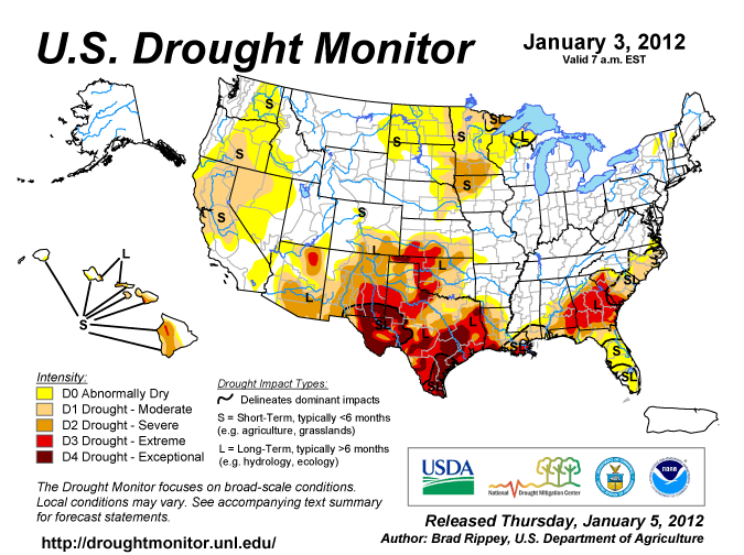
According to the Houston forecast office, they're expecting 1-3" on average for most of their forecast area with locally heavier amounts up to 5" today. That's a lot of rain, particularly for an area that still is in a large precipitation deficit. Here's the latest national drought monitor image (from January 3rd, released January 5th):
Much of Texas, particularly south Texas, and parts of Oklahoma are still in "extreme" to "exceptional" drought. Hopefully today's rains will help alleviate some of that...
Let's look at how the upper-air pattern is going to change over the next few days. Here's the current 500mb picture from this morning's GFS analysis:
You can see the cut-off low centered over the El Paso area. By Wednesday morning, the low is forecast to have move eastward across the deep South.
However, notice that there's a shortwave trough that's beginning to dig in from up in Canada. In this 48-hour forecast the trough is centered over southern Manitoba back through Eastern Montana. This trough is forecast to deepen pretty significantly over the following 48 hours. The little cut-off low in the south is forecast to move up the east coast, helping to bring in warm air from out over the Gulf Stream. As the shortwave trough digging in from Canada in the above image moves eastward, it's going to encounter the rather strong baroclinic zone (warm-cold temperature gradient) left behind by the little cut-off low over the east coast. Remember that upper-level winds are strengthened by strong horizontal temperature gradients below. As such, that shortwave trough really starts getting strong by Friday morning:
This could mean some pretty crazy weather in the northeast on Thursday and Friday of this week. We'll have to keep an eye on that.
But notice what is happening to the overall upper-air pattern--a strong ridge is building over the west coast, while large-scale troughing is occurring over most of the US east of the Rockies. This would be considered the longwave pattern, as opposed to the shortwaves we usually talk about. Shortwaves are the smaller troughs embedded in the bigger, longwave pattern. Here the longwave pattern has shifted to ridging over the east Pacific and troughing over the central US. This is actually a very typical La Nina type of upper-air pattern.
And if we're getting into a typical La Nina type pattern, all of those long-term weather predictions about the type of winter to expect should start coming into line. The pattern is forecast to become even more established by Saturday:
Still a big ridge in the eastern Pacific with troughing over the eastern US. Notice the location of the jet stream--down the Rockies and then out eastward over Texas and the south. Since the winds aloft are connected to temperature gradients below, the jet stream often marks the boundary between cold, arctic air to the north and warmer, subtropical air to the south. With this large-scale troughing in place, we can anticipate much cooler temperatures across much of the central US by the end of the week. Here's the forecast 1000-500mb thicknesses (a proxy for temperature throughout the lower atmosphere) on Saturday morning:
Anywhere north of the solid blue line is usually cold enough to support snow. You can see that everywhere except for the southern-most tier of states is in the snow regime. We're talking high temperatures in the teens and 20s for parts of the northern US by the end of the week. Looks like winter is going to happen this year after all.
According to the Houston forecast office, they're expecting 1-3" on average for most of their forecast area with locally heavier amounts up to 5" today. That's a lot of rain, particularly for an area that still is in a large precipitation deficit. Here's the latest national drought monitor image (from January 3rd, released January 5th):
Much of Texas, particularly south Texas, and parts of Oklahoma are still in "extreme" to "exceptional" drought. Hopefully today's rains will help alleviate some of that...
Let's look at how the upper-air pattern is going to change over the next few days. Here's the current 500mb picture from this morning's GFS analysis:
You can see the cut-off low centered over the El Paso area. By Wednesday morning, the low is forecast to have move eastward across the deep South.
However, notice that there's a shortwave trough that's beginning to dig in from up in Canada. In this 48-hour forecast the trough is centered over southern Manitoba back through Eastern Montana. This trough is forecast to deepen pretty significantly over the following 48 hours. The little cut-off low in the south is forecast to move up the east coast, helping to bring in warm air from out over the Gulf Stream. As the shortwave trough digging in from Canada in the above image moves eastward, it's going to encounter the rather strong baroclinic zone (warm-cold temperature gradient) left behind by the little cut-off low over the east coast. Remember that upper-level winds are strengthened by strong horizontal temperature gradients below. As such, that shortwave trough really starts getting strong by Friday morning:
This could mean some pretty crazy weather in the northeast on Thursday and Friday of this week. We'll have to keep an eye on that.
But notice what is happening to the overall upper-air pattern--a strong ridge is building over the west coast, while large-scale troughing is occurring over most of the US east of the Rockies. This would be considered the longwave pattern, as opposed to the shortwaves we usually talk about. Shortwaves are the smaller troughs embedded in the bigger, longwave pattern. Here the longwave pattern has shifted to ridging over the east Pacific and troughing over the central US. This is actually a very typical La Nina type of upper-air pattern.
And if we're getting into a typical La Nina type pattern, all of those long-term weather predictions about the type of winter to expect should start coming into line. The pattern is forecast to become even more established by Saturday:
Still a big ridge in the eastern Pacific with troughing over the eastern US. Notice the location of the jet stream--down the Rockies and then out eastward over Texas and the south. Since the winds aloft are connected to temperature gradients below, the jet stream often marks the boundary between cold, arctic air to the north and warmer, subtropical air to the south. With this large-scale troughing in place, we can anticipate much cooler temperatures across much of the central US by the end of the week. Here's the forecast 1000-500mb thicknesses (a proxy for temperature throughout the lower atmosphere) on Saturday morning:
Anywhere north of the solid blue line is usually cold enough to support snow. You can see that everywhere except for the southern-most tier of states is in the snow regime. We're talking high temperatures in the teens and 20s for parts of the northern US by the end of the week. Looks like winter is going to happen this year after all.
Wednesday, December 14, 2011
A warm winter rain with isentropic lift
Today an upper-level shortwave moving across the Great Plains (as seen in this 500 mb map)...
...and associated lift with this feature is helping to bring lots of rainy weather to much of the central part of the country. A surface low is trying to develop along the baroclinic zone (a zone of horizontal temperature gradients) that is interacting with the jet streak aloft. Here's the radar and surface analysis from late this morning:
Areas of rain with embedded thunderstorms. This is somewhat unique for this time of year (though not completely unheard of), particularly in the upper midwest. Usually we'd be expecting snow by mid-December--not heavy rain. But, temperatures are far from snow-producing with this weather event. Here's the GFS forecast surface temperature map for 18Z this morning:
Notice that there is a large, expansive warm sector associated with this developing cyclone--temperatures in the 40s stretch as far north as northern Illinois and Indiana, and east all the way through Virginia and Maryland. Even up into Minnesota we're still well into the 40s at the surface--much too warm for any snow.
The horizontal temperature gradients are not to strong with this cyclone as of yet, and that may be helping to slow its development. It looks like there's a cold front trying to form back across Nebraska and western Kansas, but the air behind it really isn't that cold. Furthermore, the winds behind the front have a strong westerly component, meaning they are coming off the high elevations of the Rockies and the high plains and down to lower elevations further east. This sinking motion of the air will cause it to warm, further weakening any developing temperature gradients. So, in short, this storm doesn't look like it's going much of anywhere on the cold air side.
The temperatures aloft also don't look very conducive for snow formation. One parameter we often look at to get a quick first guess if it's going to snow or not is something called thickness charts, specifically with reference to a "critical thickness". I wrote a blog post about this a while back, and you can read that here. Basically, as the atmosphere gets warmer, air expands and the "thickness" between two pressure levels increases. The opposite happens when the atmosphere gets colder--the thickness decreases. Here's a map of the GFS 6-hour forecast of 1000mb-500mb thickness for 18Z today:
Thicknesses are shown in the blue and red dashed lines. The blue solid line is the 5400 meter thickness line--often used as a "critical" thickness value. North of this line where the thicknesses are lower, the lower atmosphere tends to be cold enough to support snow. South of this line where thicknesses are higher, the lower atmosphere tends to be too warm to produce snow. This doesn't always hold true, but it's often a good guess. You can see here that the "critical" thickness line is well to the north of the areas of precipitation--back across the northern plains and up through Lake Superior. This is just another way of seeing how expansive that warm sector of this wave has become.
With all this warm advection to the east of the shortwave aloft, it would make sense that we're getting lots of clouds and rain, if only we could prove that there was rising motion going on. Lots of warmth and moisture aren't enough by themselves to cause clouds and precipitation--we need some mechanism to lift that air so it cools to its dewpoint and starts condensing into those clouds and precipitation.
One peculiar thing about air motions in the atmosphere is that often the air tends to follow "adiabatic" or "isentropic" surfaces. As long as a parcel of air moves along an adiabatic surface, it does not gain or lose any energy. This is one reason air tends to follow these surfaces--it takes very little effort to do so. So, if the isentropic surface happens to be tilted upward and the winds are blowing air along this upward-tilted isentropic surface, the air will naturally want to rise along the surface. This can be a source of widespread lifting motion and lead to lots of clouds and precipitation.
Here's a map of one particular isentropic surface this morning--the 295 Kelvin isentropic surface. The blue contours are the height of the surface above the ground in terms of pressure level. This means that the lower the numbers get, the higher the isentropic surface is above the ground. Also shown are the winds along this surface and the theta-e (a way of looking at moisture and temperature) of the air at this level.
We see, following the blue contours, that this particular isentropic surface tilts upward to the north. In south Texas, this isentropic surface is at the 950mb pressure level. It's up at the 900mb pressure level by central Oklahoma, then rapidly rises through the central plains and upper midwest to 750 mb by central Wisconsin back towards central Colorado. Furthermore, look at the winds on this level from Texas up through the central plains and into the upper midwest. They're blowing generally from south to north. Also, high theta-e values (the green shading) indicate very moist air.
So what does this mean? We have southerly winds pushing moist air up along a surface that tilts upward as it goes further north. So, as air parcels are pushed northward by these winds, they rise along with the isentropic surface (until they become saturated). As this air rises, it will cool until the dewpoint is reached and clouds and precipitation start to form. So, on this map, we're seeing a strong lifting mechanism from Texas up through the central plains and into the Mississippi River valley and the midwest. We call this "isentropic lift". And this explains a lot of why in the infrared satellite image...
...we see a big swath of clouds in that exact same region. Air is being pushed northward along a surface that tilts upward in that direction. So the air rises right along with it. The result? A widespread area of clouds and precipitation anywhere we're seeing strong isentropic lift.
...and associated lift with this feature is helping to bring lots of rainy weather to much of the central part of the country. A surface low is trying to develop along the baroclinic zone (a zone of horizontal temperature gradients) that is interacting with the jet streak aloft. Here's the radar and surface analysis from late this morning:
Notice that there is a large, expansive warm sector associated with this developing cyclone--temperatures in the 40s stretch as far north as northern Illinois and Indiana, and east all the way through Virginia and Maryland. Even up into Minnesota we're still well into the 40s at the surface--much too warm for any snow.
The horizontal temperature gradients are not to strong with this cyclone as of yet, and that may be helping to slow its development. It looks like there's a cold front trying to form back across Nebraska and western Kansas, but the air behind it really isn't that cold. Furthermore, the winds behind the front have a strong westerly component, meaning they are coming off the high elevations of the Rockies and the high plains and down to lower elevations further east. This sinking motion of the air will cause it to warm, further weakening any developing temperature gradients. So, in short, this storm doesn't look like it's going much of anywhere on the cold air side.
The temperatures aloft also don't look very conducive for snow formation. One parameter we often look at to get a quick first guess if it's going to snow or not is something called thickness charts, specifically with reference to a "critical thickness". I wrote a blog post about this a while back, and you can read that here. Basically, as the atmosphere gets warmer, air expands and the "thickness" between two pressure levels increases. The opposite happens when the atmosphere gets colder--the thickness decreases. Here's a map of the GFS 6-hour forecast of 1000mb-500mb thickness for 18Z today:
Thicknesses are shown in the blue and red dashed lines. The blue solid line is the 5400 meter thickness line--often used as a "critical" thickness value. North of this line where the thicknesses are lower, the lower atmosphere tends to be cold enough to support snow. South of this line where thicknesses are higher, the lower atmosphere tends to be too warm to produce snow. This doesn't always hold true, but it's often a good guess. You can see here that the "critical" thickness line is well to the north of the areas of precipitation--back across the northern plains and up through Lake Superior. This is just another way of seeing how expansive that warm sector of this wave has become.
With all this warm advection to the east of the shortwave aloft, it would make sense that we're getting lots of clouds and rain, if only we could prove that there was rising motion going on. Lots of warmth and moisture aren't enough by themselves to cause clouds and precipitation--we need some mechanism to lift that air so it cools to its dewpoint and starts condensing into those clouds and precipitation.
One peculiar thing about air motions in the atmosphere is that often the air tends to follow "adiabatic" or "isentropic" surfaces. As long as a parcel of air moves along an adiabatic surface, it does not gain or lose any energy. This is one reason air tends to follow these surfaces--it takes very little effort to do so. So, if the isentropic surface happens to be tilted upward and the winds are blowing air along this upward-tilted isentropic surface, the air will naturally want to rise along the surface. This can be a source of widespread lifting motion and lead to lots of clouds and precipitation.
Here's a map of one particular isentropic surface this morning--the 295 Kelvin isentropic surface. The blue contours are the height of the surface above the ground in terms of pressure level. This means that the lower the numbers get, the higher the isentropic surface is above the ground. Also shown are the winds along this surface and the theta-e (a way of looking at moisture and temperature) of the air at this level.
We see, following the blue contours, that this particular isentropic surface tilts upward to the north. In south Texas, this isentropic surface is at the 950mb pressure level. It's up at the 900mb pressure level by central Oklahoma, then rapidly rises through the central plains and upper midwest to 750 mb by central Wisconsin back towards central Colorado. Furthermore, look at the winds on this level from Texas up through the central plains and into the upper midwest. They're blowing generally from south to north. Also, high theta-e values (the green shading) indicate very moist air.
So what does this mean? We have southerly winds pushing moist air up along a surface that tilts upward as it goes further north. So, as air parcels are pushed northward by these winds, they rise along with the isentropic surface (until they become saturated). As this air rises, it will cool until the dewpoint is reached and clouds and precipitation start to form. So, on this map, we're seeing a strong lifting mechanism from Texas up through the central plains and into the Mississippi River valley and the midwest. We call this "isentropic lift". And this explains a lot of why in the infrared satellite image...
...we see a big swath of clouds in that exact same region. Air is being pushed northward along a surface that tilts upward in that direction. So the air rises right along with it. The result? A widespread area of clouds and precipitation anywhere we're seeing strong isentropic lift.
Sunday, November 14, 2010
A Closer Look at Critical Thickness
Last time I talked about the impending "arctic outbreak" that was being forecast to occur at the end of this week (I also have a brief update on that at the end of the post). I mentioned that one product we could look at was a plot of 1000-500 mb thickness to serve as a rough guide to a dividing line between snowfall and rainfall in our precipitation. On a side note, I also jumped ahead last week (kind of) and made a statement that for much of the upper midwest this arctic outbreak could bring the first snows for much of the upper midwest. I neglected to look in the near term and, as many people in Minnesota, Iowa and parts of Wisconsin now have seen, the first decent snowfall occurred this weekend:
However, more of the midwest, including points east of that snow swath, could see their first snow later this week. I based that on using an analysis product that contoured the 1000-500 mb thickness and talked about how there was this "magical" rule of thumb where the dividing line between snow and rain was typically at the 5400 m 1000-500 mb thickness contour. However, that's not the only thickness rule of thumb that exists. Below is a plot of critical thicknesses for several different layers (more than just 1000-500 mb) from the College of DuPage's model output.
![]() |
| Fig 1 -- 2-day snow accumulations as of 1500Z, Nov 14, 2010. From NCDC. |
![]() |
| Fig 2 -- Critical thickness analysis values from an operational WRF-NMM model at 12Z, Nov 14, 2010. From the College of DuPage website. |
And below is their guide to what each of the contours represent (the shading is (I think, because it's not labelled) 850 mb relative humidity, a rough proxy for where precipitation may be falling):
| RED = 1000-700mb 2840m Thickness Contour | CYAN = 850-700mb 1540m Thickness Contour | YELLOW = 1000-850mb 1300m Thickness Contour |
| MAGENTA = 700-500mb 2560m Thickness Contour | GREEN = 850-500mb 4100m Thickness Contour | WHITE = 1000-500mb 5400m Thickness Contour |
| BLUE = 850mb 0 degree Isotherm |
Why are these called "critical" thicknesses? The "critical" part comes from their association with the rain-snow dividing line. For each of these layers, empirical experience has shown that these particular thickness values usually correspond to the approximate rain-snow dividing line. However, critical thickness values are different in different locations. There are also many, many examples where critical thickness levels did not correspond to the actual rain-snow line. But, in general, these provide a good first guess for estimating precipitation type. By looking at several different layers and their critical thicknesses (like in figure 2 above), we can gain a reasonable degree of confidence about what kind of precipitation will fall. For example, if you happen to be north of every single critical thickness line (assuming it's colder to he north, which it almost always is), you're pretty sure to receive snow. If you're in the middle of the spread of lines, that's much less certain.
But what do these critical thickness values really mean? Sure they came from "years of observation", but what can they tell us about the difference between rain and snow? I mentioned in my last post that the thickness of a layer is related to the mean temperature in that layer, with a colder mean temperature corresponding to a "thinner" thickness. There's actually a (relatively simple) equation to describe this, known to most meteorology students as the hypsometric equation:
| --From the Wikipedia page for the hypsometric equation |
Where h is the thickness, R is the gas constant for dry air (287 J/kg/K), g is the acceleration due to gravity (9.81 m/s^2), and T is the mean (virtual) temperature (in Kelvin) of the layer. P1 is the pressure at the bottom of the layer and P2 is the pressure at the top of the layer. We know the pressures at the top and bottom of our layer and the critical thickness of the layer, so we can solve this for the mean temperature we would expect to find in each layer when the layer's thickness is at the critical thickness. The results are shown below:
| Mean Temperature Calculated from Layer Thickness | ||
| Pressure Levels (mb) | Thickness (meters) | Mean Temperature (degrees Celsius) |
| 1000-700 | 2840 m | -0.8 ⁰C |
| 700-500 | 2560 m | -13 ⁰C |
| 850-700 | 1540 m | -2 ⁰C |
| 850-500 | 4100 m | -9 ⁰C |
| 1000-850 | 1300 m | 0.4 ⁰C |
| 1000-500 | 5400 m | -7 ⁰C |
Table 1 --Calculated mean temperatures based on layer thicknesses via the hypsometric equation.
What can we see from these numbers? A couple things stand out:
- The 1000-850 mb critical thickness of 1300 m corresponds to a mean temperature of 0.4 degrees Celsius. That's an average temperature above freezing. This tells us that snow can fall even when the temperature is above freezing at the surface. We see this quite often, actually, and usually the snow that falls is very wet snow. Frozen snowflakes falling from above need time as they fall to melt, so if the layer above freezing is relatively shallow, the snowflakes simply don't have time to fully melt before they hit the ground.
- The mean temperature in the 700-500 layer should be cooler than -13 degrees Celsius. This represents a temperature on the upper bound of the so-called "dendritic growth zone". It turns out that the most vigorous production of snowflakes tends to occur where there are temperatures between -12 to -18 degrees Celsius (the exact numbers will vary depending on what study you look at or who you ask). Therefore, it would make sense that we need to have a layer that is at least that cold to be confident in seeing snowflakes (if snow is forming).
- The mean temperatures never get above freezing except in the lowest layer. This implies that if we ever see the temperature on our profile get above freezing (except for in a very near-surface layer, but even then...) we must begin to seriously question whether or not snow will fall. A small layer above freezing may not be enough to fully melt the snow crystals. However, a relatively deep layer above freezing will start pulling the mean values in layers spanning that particular layer closer to the freezing point. This will in turn warm the mean temperatures in those layers beyond these "critical" values.
- If we actually plot these mean temperature values at the average pressure levels they represent and calculate some rough lapse rates (not shown here), we see that below ~800 mb the lapse rate represented by this profile is absolutely stable and above ~800 mb the lapse rate becomes conditionally unstable. I believe this implies that critical thickness values may be more representative in atmospheres where the lower part of the troposphere (i.e. below ~800 mb) is statically stable, since the further our lapse rates stray from the idealized lapse rates in this profile, the less representative of the atmosphere this critical thickness idealization will be. (I was initially dubious when I had this idea until I saw this paper by Paul Heppner (1992). It's an excellent review of how accurate critical thickness values are based on a statistical analysis. He also confirms a tendency for the values to be more applicable in a stable environment).
So, remember--critical thickness plots are fun tools that can help provide an initial guess at checking precipitation type. It's always best to check multiple critical thickness values for different layers to get a clearer picture of what's going on. And, we can see from the simple calculations above what these critical thickness values can tell us about a typical snow vs a typical rain environment. There's a lot more analysis that could be done, but this is just a flavor of what critical thickness implies.
***UPDATE: The upcoming "arctic outbreak"***
Remember last time I mentioned how we would want to see a buildup of really cold arctic air on our side of the globe if we were to have an "arctic outbreak" here later this week? Here is the hemispheric plot of 500 mb heights (or, in proxy form, temperature) from 48 hours ago:
![]() |
| Fig 3 -- Northern Hemispheric plot of 500 mb heights (shaded) and mean sea-level pressure (contoured) from 12Z, Nov. 12, 2010. From the HOOT website. |
We can see that the coldest air (represented by the lowest 500 mb heights) was just about centered over the North Pole two days ago. Now look at this morning's plot:
![]() |
| Fig 4 -- Northern Hemispheric plot of 500 mb heights (shaded) and mean sea-level pressure (contoured) from 12Z, Nov. 14, 2010. From the HOOT website. |
The center of the cold air has shifted off the pole! Not only that, but it has shifted toward the North American side. Could this be the beginning of our arctic outbreak air? Possibly. Remember this air has a long way to go before it gets down here, and interactions with the land can warm the air considerably. (Though this weekend's snow cover over the upper midwest won't do anything to help warm the air mass, if the snow sticks around...)
Thursday, November 11, 2010
The "Arctic Outbreak"
Nearly every weather blog (and forecast discussion) that I've been reading as of late has been talking about this greatly hyped "arctic outbreak" that is supposed to occur in the latter half of next week. I thought I'd add a few of my own perspectives on this discussion. Let's start by taking a look at current 500 mb heights across the entire polar region.
Note the north pole is in the middle of this image. We're going to focus on the shading here which represents 500 mb heights. We can use 500 mb heights as a rough proxy for temperature (though it would be better if we were using thickness...more on that later). How can we do this? This somewhat gets back to the reasoning behind my very first blog post. To put it simply, imagine a column of air stretching between the ground and the 500 mb pressure level. When we warm air, it expands--simple physics (or chemistry, if you like). So if we warm that column of air, it expands. Since the ground is fixed and cannot move, the only way for the column to expand is in the vertical direction, which is going to lift the 500 mb height higher as the column expands. Therefore warmer air tends to be found under higher heights and colder air tends to be found under lower heights (cooling air makes it contract, pulling down a pressure surface at the top of the column.) Thus in the image above, higher heights (conveniently represented by the warmer colors) can be thought of as areas of generally warmer air and lower heights (the cooler colors) can be thought of as areas of generally cooler air.
As noted by Patrick Marsh in a blog post a few days ago, often when we see large intrusions of warm air into the polar regions, the response after a few days is typically for a large airmass of cold air to move southward somewhere. Last week there was a large plume of tropical air evident over the central Atlantic stretching well north to near Iceland. This week, as seen in figure 1 above, there's a decently large tongue of warm air that is intruding across the eastern US and Canada as far north as northern Baffin Island. With these surges of warm air north, it makes sense that we would be expecting a surge of colder air south.
But what colder air? The really deep, cold arctic air is going to be found where we have the dark blues and purples in the above image. It's clear that our coldest areas are directly over the north pole and in a trough near the British Isles north of Europe. There's cool air, but nothing frigidly cold on the North American side of the arctic. For the US to see an arctic outbreak, we would want to see a really, really cold air mass building on our side of the globe. Much colder than anything we see there now. Why so cold to begin with? We have to remember that as an arctic airmass is dislodged and moves southward, it is constantly being modified. It's moving over land that has been warmed by the sun, the air itself is being heated by the sun every day and many other things contribute to warming the air mass as it moves south. For it to still be really cold when it gets here, it had to be REALLY REALLY cold to begin with. And we're not really seeing that yet...
Of course, we're still a week away. So, we'll keep watching the arctic to see if such a cold air mass does indeed build on our side of the arctic. So what's everyone getting so hyped about? Models. Long-range models. Which are not the most reliable things to look at. However, they are pretty much the only thing to look at. Below are the 850mb temperatures for a 168-hour forecast from this morning's European (ECMWF) and GFS models. This would be a forecast for 12 Z next Thursday, or sometime early that morning.
The color shading for temperatures here is in Fahrenheit. Often times, the 12Z temperatures are used as a good guess for what the nightly low temperature is going to be, so this represents about the coldest temperatures next Thursday morning. We can see that a broad area of the upper midwest is forecast to drop into the teens that morning. That's a big contrast from the current lows in the mid 40s that a lot of the upper midwest is enjoying. And if that cold air advection is continuing (note the winds at the surface are also bringing down colder air), it will probably get colder...
One more thing to look at quickly. This is a contour plot of the GFS forecast 1000-500mb thickness (which is technically what we should be using as a proxy for temperature instead of just heights) for that same 168-hour forecast.
The thickness between two pressure levels is simply the height above ground of one level minus the height above ground of the other level, or how thick (in meters) the layer between those two pressure levels happens to be. It's pretty straightforward. Because both levels are pressure levels which can move up and down (unlike the ground, which is fixed), it turns out that the thickness is an even better proxy for mean temperature in the layer between the two pressure levels than raw height would be. Since 1000 mb is nearly at the surface (or often below the surface...which makes for an interesting story that I'll explain in another blog), the 1000-500mb thickness is a good indication of the mean temperatures in the lowest half of the atmosphere.
So what is this map above telling us? Thickness is often used to help decide which type of precipitation is going to fall. Is it going to be rain? Snow? Something frozen in between? The colder the lowest half of the atmosphere is, the more likely there is going to be snow falling instead of rain--that makes sense. Since colder air implies a lower thickness (cold air contracts), we'd want to look for lower thickness values to find areas where snow is likely. It turns out, from lots and lots of analytical experience, that a good dividing line between rain and snow is usually around the 5400 m 1000-500mb thickness line (conveniently (or rather intentionally) contoured as the thick blue line on the map above). Areas to the north of that line (the blue dashed contours) have a lower thickness and areas to the south (the red dashed contours) have a deeper thickness.
Therefore, areas with thicknesses less than 5400 m (in this case anywhere north of the 5400 m contour) could expect to have an atmosphere cold enough to support snow. This means, in figure 4, that anywhere north of the 5400 m line could see some snow if any precipitation falls with this system. This could mean the first real snowfall for much of the upper midwest.
So, there you go. In summary, IF frigid arctic air can build on our side of the globe and be cold enough to survive modification on its trip down here, then MAYBE our really long range models will verify and we'll see some colder air move in to the central US. Our models don't have the best track record in forecasts at this long of a range, so they shouldn't be interpreted literally. But in terms of general trends, it does give you something to think about...
![]() |
| Fig 1 -- 500 mb heights (shaded) with MSLP contours for the entire Northern Hemisphere at 12Z, Nov 11 2010. From the HOOT site. |
As noted by Patrick Marsh in a blog post a few days ago, often when we see large intrusions of warm air into the polar regions, the response after a few days is typically for a large airmass of cold air to move southward somewhere. Last week there was a large plume of tropical air evident over the central Atlantic stretching well north to near Iceland. This week, as seen in figure 1 above, there's a decently large tongue of warm air that is intruding across the eastern US and Canada as far north as northern Baffin Island. With these surges of warm air north, it makes sense that we would be expecting a surge of colder air south.
But what colder air? The really deep, cold arctic air is going to be found where we have the dark blues and purples in the above image. It's clear that our coldest areas are directly over the north pole and in a trough near the British Isles north of Europe. There's cool air, but nothing frigidly cold on the North American side of the arctic. For the US to see an arctic outbreak, we would want to see a really, really cold air mass building on our side of the globe. Much colder than anything we see there now. Why so cold to begin with? We have to remember that as an arctic airmass is dislodged and moves southward, it is constantly being modified. It's moving over land that has been warmed by the sun, the air itself is being heated by the sun every day and many other things contribute to warming the air mass as it moves south. For it to still be really cold when it gets here, it had to be REALLY REALLY cold to begin with. And we're not really seeing that yet...
Of course, we're still a week away. So, we'll keep watching the arctic to see if such a cold air mass does indeed build on our side of the arctic. So what's everyone getting so hyped about? Models. Long-range models. Which are not the most reliable things to look at. However, they are pretty much the only thing to look at. Below are the 850mb temperatures for a 168-hour forecast from this morning's European (ECMWF) and GFS models. This would be a forecast for 12 Z next Thursday, or sometime early that morning.
![]() |
| Fig 2 -- ECMWF (above) and GFS (below) 850 mb height and temperature 168-hour forecasts for 12Z, Nov. 18, 2010. From the HOOT site. |
Note that in these images, the color shading represents the temperatures explicitly, not the heights (which are contoured). Even at this rather low level, you can still see how the wavy pattern separating the warm and cold air just about follows the wavy pattern of the height contours. It gives us better faith in our 500 mb analysis above. Anyhow, at 850mb in both models for next Thursday you see temperatures in the -5 to -10 degree Celsius range across much of the upper midwest. This represents temperatures that are several degrees below freezing in the very low levels of the atmosphere. Also note the strong northwesterly to northerly winds in the cold air on the western side of the trough. With even colder air to the north, this shows strong cold air advection, indicating that by Friday it will probably get even colder (it does in the GFS model, but I didn't have an ECMWF image from them to show for comparison). If you remember the relationship between cooling air and changing heights as mentioned above, you might also suspect that with all that cold air advecting into the base of the trough, the heights there would fall (cooling air contracts) and the trough would be getting deeper. We'd have to check multiple levels to confirm this, but it's a pretty good bet this is a strengthening trough. (I note this is only a model forecast...).
So we do indeed see an impinging mass of colder air. What does this mean for surface temperatures (what we actually feel)? Here is a GFS model forecast for those at the same time:
![]() |
| Fig 3--GFS model 168-hour forecast surface temperatures for 12Z, Nov. 18, 2010. From the HOOT site. |
One more thing to look at quickly. This is a contour plot of the GFS forecast 1000-500mb thickness (which is technically what we should be using as a proxy for temperature instead of just heights) for that same 168-hour forecast.
![]() |
| Fig 4--GFS 168-hour forecast of 1000-500mb thickness for 12Z, Nov. 18, 2010. From the HOOT site. |
So what is this map above telling us? Thickness is often used to help decide which type of precipitation is going to fall. Is it going to be rain? Snow? Something frozen in between? The colder the lowest half of the atmosphere is, the more likely there is going to be snow falling instead of rain--that makes sense. Since colder air implies a lower thickness (cold air contracts), we'd want to look for lower thickness values to find areas where snow is likely. It turns out, from lots and lots of analytical experience, that a good dividing line between rain and snow is usually around the 5400 m 1000-500mb thickness line (conveniently (or rather intentionally) contoured as the thick blue line on the map above). Areas to the north of that line (the blue dashed contours) have a lower thickness and areas to the south (the red dashed contours) have a deeper thickness.
Therefore, areas with thicknesses less than 5400 m (in this case anywhere north of the 5400 m contour) could expect to have an atmosphere cold enough to support snow. This means, in figure 4, that anywhere north of the 5400 m line could see some snow if any precipitation falls with this system. This could mean the first real snowfall for much of the upper midwest.
So, there you go. In summary, IF frigid arctic air can build on our side of the globe and be cold enough to survive modification on its trip down here, then MAYBE our really long range models will verify and we'll see some colder air move in to the central US. Our models don't have the best track record in forecasts at this long of a range, so they shouldn't be interpreted literally. But in terms of general trends, it does give you something to think about...
Subscribe to:
Posts (Atom)