As we begin this new year, I thought it might be interesting to look at the longer-range forecasts from the Climate Prediction Center for the next several months. Our longer-term prediction like this is somewhat different from what we're used to in normal weather prediction. We aren't very specific--no forecasts of "it will rain on this day and not on this day" or "the high on February 10th will be 54 degrees". Instead our long-range forecasts deal in probabilities of being above or below normal for both precipitation and temperature. For example, here's the CPC's three-month outlook for precipitation over the US:
Areas in green indicate areas where they're predicting above normal precipitation over the next three months and areas in brown indicate a forecast of below normal precipitation over the next three months. The darker the colors, the higher the probability that this will occur. For instance, the darkest colors on this plot indicate a 50% chance that it will be above or below average in precipitation. Notice the geographical pattern here--there are higher probabilities for above normal precipitation in the northwest and in the eastern midwest/Ohio River valley. The southern US, however is forecast to have higher probabilities for below normal precipitation.
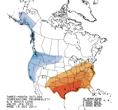
What about temperatures? Here's the CPC's 3-month forecast for that:
Here we see higher probabilities of below normal temperatures in the western US (particularly here in Seattle) and higher probabilities of above normal temperatures in the south and along the east coast.
So how do we make these extended forecasts for temperature and precipitation? Even though our weather models lose their ability to predict day-to-day weather conditions after more than 7-10 days, we have several larger-scale patterns in the atmosphere that are correlated with particular weather patterns locally. One of the most well-known of these large-scale patterns is the El Nino/La Nina oscillation (often abbreviated as "ENSO" for El Nino/Southern Oscillation). A lot of research has pointed toward statistically significant correlations between certain weather patterns and the state of El Nino or La Nina. I'm not going to go into the mechanics of El Nino and La Nina here (that will be in another post), but, just in general, El Nino conditions tend to be correlated with one certain weather pattern and La Nina conditions tend to be correlated with another weather pattern.
Here's a measure of the state of El Nino/La Nina over the past several years. Blue colors indicate cooler than normal sea-surface temperatures in the central Pacific (La Nina conditions) while red colors indicate warmer than normal sea-surface temperatures in the central Pacific (El Nino). You can see that we're in a pretty solid La Nina state right now (though not as strongly as we were last year at this time).
So what can we do with this information? Notice in the figure above that each La Nina or El Nino episode tends to last for quite some time--often on the order of many months to years. Because of that, we can guess that the patterns associated with an El Nino or a La Nina will also last for that amount of time. This gives us confidence to make some statistical predictions for the longer term.
To see this in action, here's a figure showing the typical weather patterns across the globe correlated with La Nina events. The top panel is for the winter and the lower panel is for the summer:
If we focus on the top panel (for winter), you can see that La Nina conditions are typically correlated with cooler, wetter weather in the northwest, wetter than normal conditions in the eastern midwest, and warmer, drier conditions in the south. Sound familiar? It matches up very well with the CPC's three-month forecasts above. Because we're so solidly in a La Nina pattern, the CPC has pretty good confidence that the kinds of weather we typically see in a La Nina pattern will be what we actually see over the next few months. And, to a large extent, that's all there is to this longer-term prediction.
We do have climate models that can try to predict how the ENSO state will change over time. Here's a summary of several forecast models and what they think the La Nina/El Nino state will be over the next several months:
This figure shows the sea-surface temperature anomalies in the central Pacific forecast by several long-range models. The solid black line across the middle is the zero anomaly line. Remember that colder than normal sea-surface temperatures (negative values) correspond to La Nina, while warmer than normal sea-surface temperature (positive values) correspond to El Nino conditions. You can see that the general trend in the models is for us to slowly come out of the current La Nina pattern and return to a near-neutral state by the end of this year. In a neutral state, things tend to be more volatile--we don't have as much confidence in our longer-term forecasts. So, we'll have to wait and see what this summer and autumn will hold.


No comments:
Post a Comment