Showing posts with label climatology. Show all posts

Wednesday, January 6, 2016

Temperature forecast skill sinks in Seattle

Today I was surprised to see that the NWS had forecast a high of 41 Fahrenheit this afternoon here in Seattle, but the temperature had gotten up to 51F!


They aren't the only ones who have been struggling with the temperature forecasts recently.  Let's look at some of the forecast performance.

Here is an image showing the last 30 days of high temperature forecasts for Sea-Tac Airport (KSEA) from the GFS Model Output Statistics (MOS) forecast. In the top panel, the blue line shows the 1-day forecast high temperature and the black line shows what actually occurred.  The gray dashed line in the background shows the climatological normal high temperature for each day. The bottom bar chart shows the error in the forecast each day.


You can see that Seattle's climatology (the gray dashed line) "bottomed out" around December 21st.  Our coldest high temperatures of the year are now behind us, on average.  You'll note that before then (or rather, before about Dec. 15), the GFS forecasts were actually doing fairly well.  There were several days with the high temperature forecast perfect or only within 1 degree of what actually occurred.

However, since then (over the past two or three weeks), the temperature skill has gone crazy.  There's no net bias in the forecast (the GFS hasn't been consistently too cold or too warm) but there have been a lot of days with errors greater than five degrees.  The day-to-day differences in high temperature have also been quite large, and it seems like the model just isn't capturing these swings well.

The NAM model hasn't been a whole lot better:

There have been some misses on the low temperatures, but not as bad.  Here's the same plot, but for the GFS low temperature forecast.

Still a few big misses, but not as bad as the high temperatures.

We can compare different model forecasts by looking at their skill scores, which compares the performance of the model against some standard baseline forecast.  Two common baselines used are climatology and persistence.  A climatology forecast basically follows that dashed grey line in the plots above...it just assumes you forecast the average value for that day, every day.  A persistence forecast assumes that whatever happens today will happen again tomorrow, and that's where you get your forecast.  So if today's high temperature was 51 degrees, our forecast for tomorrow would be 51 degrees again.  We would expect that a good weather forecasting system or service would be able to beat either of these baselines, otherwise it's not adding any value to the forecast.

So skill scores compare the errors from forecasts against these baselines.  A negative skill score means that the forecast system does worse than the baseline overall (bad!).  A zero skill score means the forecast system does exactly the same as the baseline, and a positive score means it does better.  A skill score of 1 means it produces a (near) perfect forecast.

Below are the skill scores for the GFS, NAM, and several other weather forecast producers like Accuweather (ACUWX), the Weather Service (NWS) and Weather Underground/The Weather Channel (WUTWC) in their high and low temperature forecasts at KSEA over the last 15 days. Blue is for low temperature, red is for high temperature.  The lighter bars are skill measured against a persistence forecast and the darker bars are skill measured against a climatology forecast. 

You can see that these scores are all positive...so we're doing better than our baselines.  But not by much!  In fact, the GFS has been almost exactly the same as persistence, and only marginally better than climatology.  The other forecast sources also have skill scores generally below 0.5, and typically here in Seattle these scores are closer to the 0.7-0.8 range.

So why have we been struggling so much with our high temperature forecasts?  For one, we've been stuck in a "split-flow" regime for the last few weeks, with storms either being directed to our north or down south into Oregon and California.  It's actually times like these when we don't have a strong synoptic-scale weather signal that our models struggle with the most, for it's on those days where local idiosyncrasies really start impacting our weather.

In particular, we've had a number of clear nights which have set up low-level cold inversions and fog overnight.  Our models tend to have a difficult time representing these low-layer inversions, particularly when it comes to mixing them out during the day.  As a result, sometimes they keep the cold and fog around for too long and sometimes they too quickly erode it away.  This has huge implications for the high temperature forecasts.

In addition, on January 3-4, we had strong easterly flow, which dried out our air but didn't actually raise the temperatures that much.  The GFS bit on the idea that downslope warming with these easterly winds coming off the Cascades would bring up our high temperatures, but that ended up not happening.

So there's a lot of little things going on that have contributed to lower skill in our forecasts.  With more ridging and dry weather expected in Seattle over the next few days, we may have to live with low predictability for a little while...

Tuesday, August 4, 2015

El Nino and Precipitation--Depends on Who You Ask

I came across an interesting divergence in opinion on what the impacts of El Nino on wintertime weather here in the Pacific Northwest might be.  First, a reminder that El Nino conditions are present in the Pacific Ocean.  Here are the latest weekly sea-surface temperatures, with anomalies on the bottom.  The next several images are from the Climate Prediction Center's ENSO page.
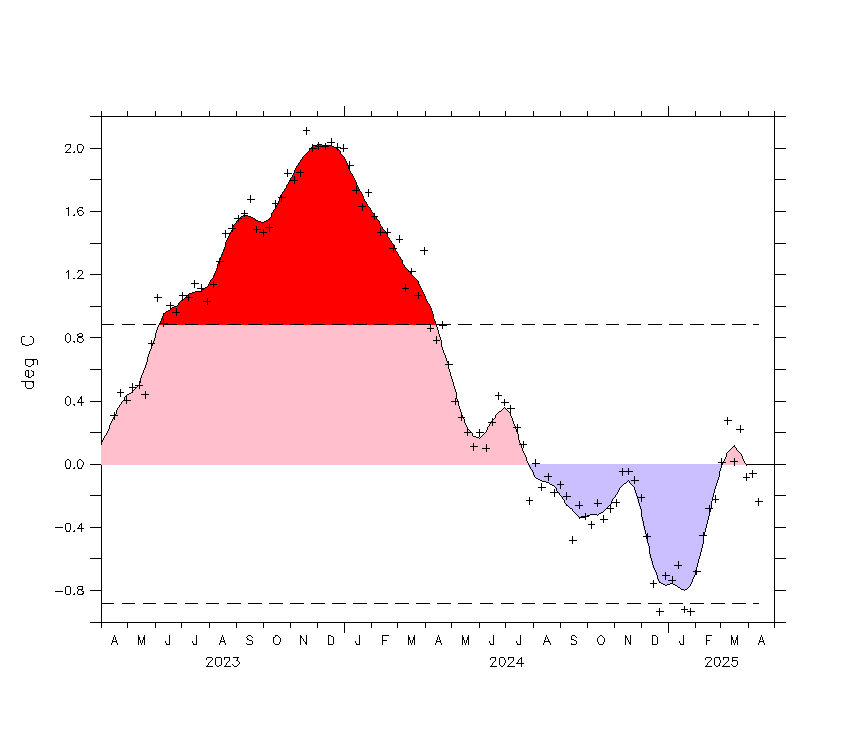
It's a classic El Nino signature with a tongue of warmer-than-average sea-surface temperatures stretching westward along the equator from western South America.  One way we often track the strength of El Nino over time is to look at something called the Nino 3.4 index, which is basically the average sea-surface temperature anomaly in the central Pacific.  Here's what that index has looked like over the past year.  The Nino 3.4 index is the second panel from the top.
Positive Nino 3.4 values indicate warmer than normal sea-surface temperatures.  Since about mid-March of this year, the Nino 3.4 index has been climbing steadily, now up to near 1.7.  Anything above 1.0 is considered an El Nino event, so this is definitely a legitimate, full-blown El Nino.

We have dynamical and statistical models that try to forecast what the Nino 3.4 index will be like for the coming months.  Here are those model projections, though they are almost a month old:
These forecasts are for three month periods, given by the letter abbreviations at the bottom on the x-axis.  You can see that by the late fall into winter (around the OND, NDJ, and DJF time) the Nino 3.4 index is predicted to peak.  There's a lot of spread, but the average maximum is between 2.0 and 2.5.  Keep in mind that the 1997-1998 El Nino event---the largest we have on record---peaked at a Nino 3.4 value of 2.3.  It's definitely possible for us to meet or beat that strength...

One of the major reasons we care so much about El Nino is that it is one of the few phenomena that can give us information about what the large-scale weather patterns will be like months in advance.  We've gotten rather good at synoptic-scale weather prediction, with forecasts good out to 10 days or so.  We also feel we have a reliable handle on large-scale climate impacts on the scale of years to decades.  But it's that in-between area---regional variability in large-scale weather patterns on the orders of weeks to months---where we really don't have much predictive skill.  Thus, anything that can give us a signal as to what may happen in that time frame is highly valued, and El Nino is the best tool we have.

We can look at what happened in past El Nino winters to get a good idea of what might happen this year.  For instance, here is a map showing the average precipitation anomalies in November through March of  El Nino years from NOAA ESRL:

We see that during El Nino years, California has usually been much wetter than normal, as has the Gulf Coast.  Interestingly enough, El Nino tends to suppress Atlantic hurricanes, so the extra rain on the Gulf Coast is NOT due to more tropical cyclones---just a rainier winter pattern.  Where does El Nino mean drier conditions?  Here in the Pacific Northwest, it seems, and also to some extent in the Midwest.

But wait...here's another map from the Climate Prediction Center that is supposed to show *almost* the same thing.  The upper left panel of this figure claims to show precipitation anomalies for December through February of major El Nino years:

Some features are very similar---we still see the increased precipitation in California, along the Gulf Coast and up the eastern seaboard.  But note the Pacific Northwest---here we see the opposite connection: significantly wetter than normal during El Nino years!  How can these two maps give such different results?

There are a couple of things that are different.  One is that the first map gives anomalies for Nov. through March whereas the second gives anomalies for Dec. through Feb.  But, there is a significant degree of overlap between the two (and actually looking at other maps from the CPC that include Nov. and March show the same "wetter" pattern).

Another is the number of cases used.  Both plots list the years that they used to make these composite averages.  The first uses what looks like only nine winters, while the second uses 22.  Looking at the strength of the El Nino events in these years, the second plot uses several weaker El Nino events not included in the first one.  So that could affect things.

We also have to pay attention to the different baselines used for making these plots.  Remember these plots are showing average departure from normal.  But what is "normal"?  In the top plot, they say that they are comparing to the 1971-2000 average.  In the second plot (if you find it on the CPC website), they are using a 1981-2010 average.  So both maps have a different view of what is "normal".  I pulled the NCEP reanalysis data for precipitation and plotted up the average Dec. -  Feb precipitation for both 1971-2000 and 1981-2010.  Here's a map of the percent change between the two:

In this plot, blue means the average precipitation was higher in 1981-2010 than in 1971-2000 while red means it was lower.  Over the Pacific Northwest there's not much of a difference.  The later time period may be slightly drier, which could maybe a explain a little bit of why the El Nino anomalies from the second plot showed it more likely to be wetter in El Nino years.  But it doesn't look like a big enough change to account for the differences we saw in the above plots. 

So the differences probably come down to the second point---using different years for the composite.  We probably don't really have enough samples to reliably draw a connection between El Nino years and what happens for Pacific Northwest precipitation during the winter.  It seems that in very strong El Nino years (as this one looks like it might be), we may tend to be drier than normal, as seen in the first plot.  But, as we include weaker El Nino years (the second plot), the signal becomes more muddled and can actually show the opposite.

One thing both of the above sources agree on, though, is warmer than normal temperatures during El Nino winters in the Pacific Northwest.  Probably not so good if you're looking to ski...

Though these anomalies are strongest during the winter months, we're already starting to see early signs that our precipitation patterns are beginning to look El Nino-like (even though we're still definitely in the summer).  Here are the most recent 90-day precipitation anomalies:

Wet in southern California and also into the southern Plains.  Not so much of a signal on the Gulf Coast, but, then again, it still is summer...

Thursday, February 26, 2015

Cold, warmth and the PNA

The weather patterns for the past month over the continental United States have been remarkably persistent.  Though we've been hearing a lot about the continued cold and snowy weather in the eastern US, not as much has been said about the unusual warmth of the western US.  Here's a map from the Southeast Regional Climate Center showing the percentile of the average high temperature over the past month compared to climatology.

In the east, particularly the northeast, you can see a lot of places where the high temperature in the past month has been in the lowest 1-3 percentile of the past 30 years.  The cold continues out in the midwest and southeast where the average high temperature has been in the 15-20% range of normal high temperatures.

Contrast this with the west, particuarly west of the Rockies.  Incredible warmth out here!  Many pleases are in the 99th percentile for high temperatures over the past month.  Extremely warm.

We can see this in the large scale pattern as well.  Here are the 90-day (three month) anomalies of 500 hPa heights over the Northern Hemisphere:

There has been a very persistent pattern over the past few months; rarely do you have such large anomalies that show up in the 90-day climatology.  Notice the pattern---anomalously low heights (associated with troughing and often colder air) in the central Pacific, anomalously high heights (associated with ridging and often warmer air) over the western US and up into Alaska, followed by another belt of lower heights over northeastern Canada and slightly into the eastern US, and then another area of high heights in the central Atlantic. This means that the atmosphere has had persistent ridging over the west. This ridging has acted like a protective shield, deflecting significant storms and cold air outbreaks to the east.  No wonder it has been so warm and pleasant in Seattle this winter...

This pattern of alternating troughs and ridges arcing across North America is something that is called a Rossby wave train and this particular pattern is known as the Pacific-North American pattern (PNA).  The PNA pattern is suspected to be caused by variations in heating along the equator.  Here's an example of what the PNA pattern is supposed to look like during the winter of a strong El Nino year:

This looks a fair bit like our anomaly pattern above, though our exact pattern is shifted a little further south and west. Because our current pattern is rather similar to this classical PNA pattern, we would say that the current pattern projects strongly on the PNA.  We can measure the correlation between the upper-level pattern of ridges and troughs every day with the classic PNA pattern.  Here's a time series of what that has looked like over the past few months from the Climate Prediction Center:

The more closely the current pattern matches the PNA pattern, the more positive the index here. We can see that, at least since mid-December, this PNA index has been slightly positive for the most part.  Remember that the cannonical PNA pattern in the map above is most prominent during El Nino periods.  Despite some signs last year that an El Nino was going to develop, we have not developed a strong El Nino this winter.  Here's the Nino 3.4 index over the past two years:
You can see that though we've been in a weakly positive (El Nino) phase for much of 2014 and into 2015, the values have not gotten up to 1.0 yet, which is a commonly-used threshold for declaring an El Nino event.

So we've been stuck in an "almost" pattern for the past several months---a weak El Nino and a weak PNA pattern.  Notice, however, in the plot of the PNA index above that there are several red lines extending into March that represent different long-range forecasts of the PNA index.  Notice that most of the forecasts are actually predicting a significant swing into a negative PNA phase.  This would mean that the pattern is more like the opposite of the PNA: more troughing in the west and ridging in the east.  Our longer-range weather forecasts are also hinting at this.  So, we may finally be getting out of this rut...

Sunday, February 8, 2015

More snow doesn't mean more liquid

Keeping on the theme from the other week, I wanted to look at the snowfall to date this year in Chicago and Boston given their recent near-record snowfall.  Fortunately the National Weather Service in Chicago makes it easy with their year-to-date climate plots.  Here's the most recent one from O'Hare Airport (KORD) in Chicago.

In the top panel you're seeing the daily temperature ranges as the dark blue bars, then in the background are the normal daily range (light green) stretching out to record highs (the light red) and record lows (light blue).  While bouncing around a bit, the temperatures in Chicago actually have been pretty near normal overall, with cold spells in early January and early February and a warm spell in mid-late January.  The next plot down is the precipitation so far this year in inches and the plot below that is the snowfall so far in inches.  The yellow lines in both plots are the "normal" precipitation up to that point in the year.  Now, precipitation doesn't smoothly fall in even amounts every day, so we never expect the actual precipitation to look like that.  Instead, it tends to follow a stair-step pattern, jumping every time there's a big event.  Anywhere you see dark green, the precipitation at that point was greater than the normal for the year at that time.

Here's what's interesting about the plots above.  You can see in the bottom panel that the total snowfall since January 1st is at 33.8 inches--almost 250% of normal.  The big snowstorm of January 31-February 2 shows up quite starkly as the abrupt jump in the snowfall.  But what about the actual liquid precipitation?  In the panel above, you can see that this is still right about normal: we've had 2.44 inches so far this year.  So, despite having extreme snow depth amounts, the actual liquid content of that snow wasn't anything to go on about.  It must have been extremely fluffy snow.

In fact, you can estimate the snow ratio from the last event.  Looks like the total gain in snowfall was 20 inches of snow (~14 inches to 33.8 inches) but the gain in precipitation was only about 1 inch (adding up the daily observations).  So the snow ratio was around 20:1---twice as big as the commonly-assumed 10:1 snow ratio we use as a ballpark figure.

The Boston forecast office doesn't seem to have nice plots like the one I showed above (in fact, most of the climatology data on the website seems to not have been updated since 2002 or, in some cases, since 1995 (!)). From the climate data, though, in January KBOS had 34.4 inches of snow (compared to a normal of 12.9 inches).  For liquid precipitation, they had 3.57 inches compared to a normal of 3.36 inches.  So, despite having over 250% of the normal snowfall, there was only slightly more liquid equivalent than normal.  The snow ratios were lower--about 10:1--but that seems to be more usual for Boston.  Regardless, incredible snow depth totals doesn't mean incredible snow liquid totals.  Thinking down the line, this means that when the spring melt-out time comes, these heavy snowfalls don't portend any unusual flooding...

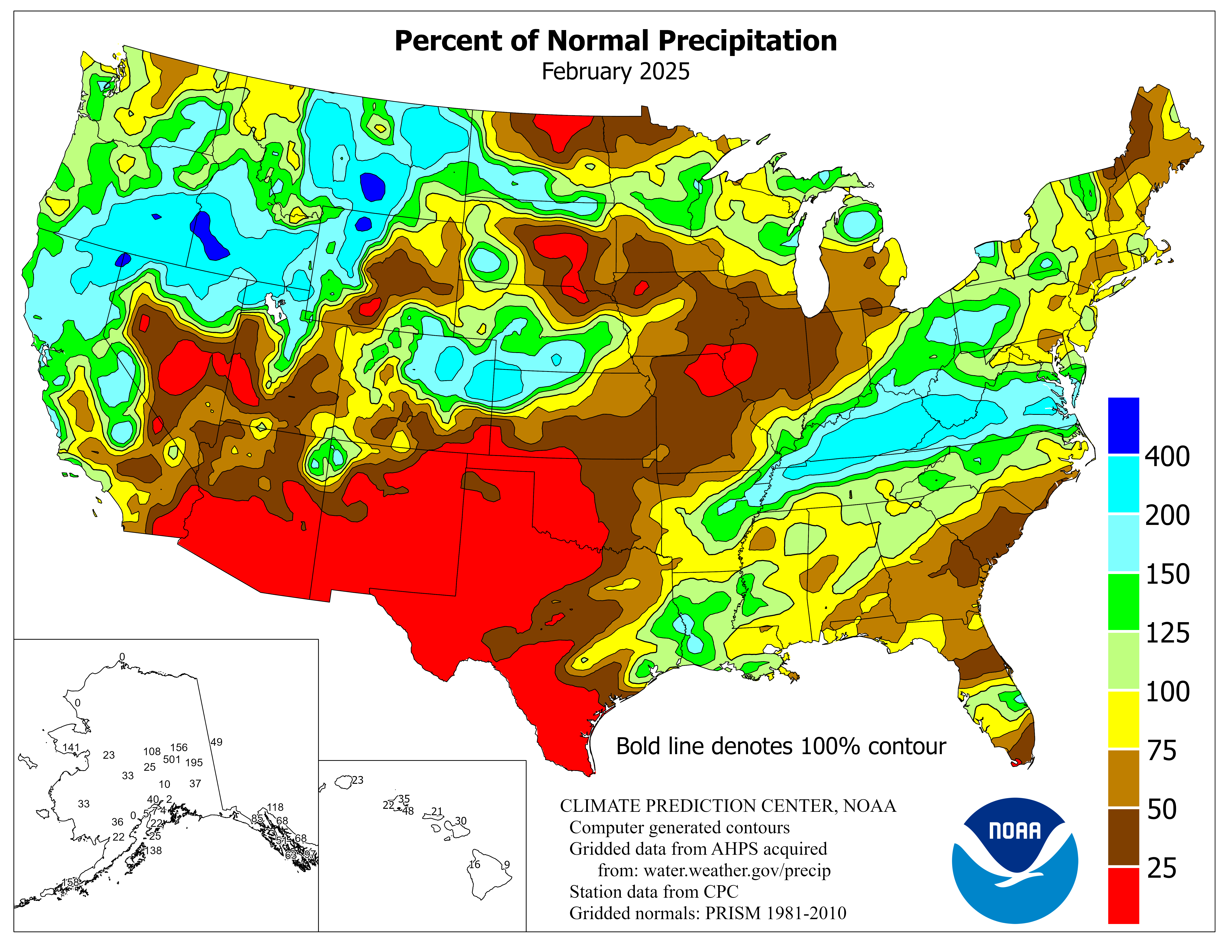
In fact, the January precipitation was near normal for most of the areas hit hard by snow, according to the Climate Prediction Center.
The two areas that stand out, though, are the continued drought in much of the western US (particularly California) and the wetter-than-normal conditions in Arizona through west Texas that were caused by a few cut-off lows that brought a lot of moisture to that region.  The effects of these anomalies will be watched in the coming months.

Wednesday, January 28, 2015

Sad Skiing in the Northwest

We go from blizzards in the northeast to an extraordinary lack of snow in the northwest. Here are the most recent snowpack estimates from the NRCS Snotel sites:

Instead of our booming snowpack we had last year, the Washington and Oregon Cascades are well below normal for this time of year---many locations only have around 25% or less of the snow they usually have.  It improves somewhat as you move east into Montana and Wyoming.  However, despite having little snow, this does NOT mean we've had little precipitation.  Here's the total precipitation percentage of normal for the same sites:
Right at 90-110% for most of Washington and Oregon!  Despite some earlier storms that brought flooding, California hasn't seem much since.  The low snow amounts in the Sierras have a lot to do with low precipitation amounts in general (for the third year in a row....).  But it's a different story up north.  Here in Washington we've had the precipitation---it has just been too warm for it to be snow.

We can look for a baseline to compare against by going to the Storm Prediction Center's new sounding climatology page.  They've basically gone through the entire record of radiosonde (weather balloon) launches over time and computed daily statistics about what various sounding parameters should look like at each site throughout the year.  We're going to look at the 850hPa temperatures from the Quillayute sounding out on the western Washington coast (KUIL).  The 850hPa temperatures give us an idea of what the temperatures have been like in the lowest part of the atmosphere.  Here's what the climatology looks like:

The smooth, solid black line running down the middle is a smoothed mean 850hPa temperature throughout the year.  The golden line above represents the 90th percentile of the 850hPa temperatures and the red lines above that represent the record maximum 850hPa temperature for each day (with the thicker red line a running mean of the daily maximum).  You can see that starting in October the 850hPa temperature is, on average, around 6 Celsius, with it dropping to just below freezing (0 Celsius) by the time we get into December and January.  On average.  I grabbed the actual 850hPa temperatures from KUIL since October 1st and here is what we have:

The solid black line is an estimate of the black mean line in the above climatology. The horizontal blue dotted line is at 0 Celsius and the red dashed line is the average over the past four months.  You can see that since about the beginning of November we've been above average, for the most part.  In fact, even though the mean 850hPa temperature should be about -1 Celsius during January, our January average to date is 4.7 Celsius---5.7 degrees warmer than normal and, notably, above freezing.   In fact, based on the climatology, our average January 850hPa temperatures are close to the 90th percentile in the climatology, with some days actually setting new warm temperature records.  

The long-term forecast has these warm conditions continuing for at least the next few months.  The CFS ensemble has high probabilities of 850hPa temperatures being above normal over the northwest.  Here's their ensemble mean forecast for February-April:
Does not look promising for more snow on the slopes out here!

Friday, January 31, 2014

Questioning the Bering Sea Rule: Part 2

In my last blog post I used the ERA-Interim reanalysis to look at a long-range forecasting technique called the "Bering Sea Rule".  This has been used by many bloggers to attempt to forecast the general weather for various parts of the eastern US several weeks in advance.  In its general form, it claims that whatever happens in the Bering Sea (weatherwise) will happen in the eastern US 2.5-3 weeks later.  However, when I tried to correlate the storminess of the Bering Sea over a 30 year period with the storminess of the eastern US at various lead times, I couldn't find any strong correlations at all in the 2.5 to 3 week (17-23 day) window purported by the Bering Sea Rule.  There were several other interesting correlations that have relations to well-known, larger scale circulation patterns but nothing special about that particular time window.

I heard back from several people after publishing part 1 of this blog with comments about my findings.  Apparently there are other groups numerically trying to validate this rule.  I'm really looking forward to seeing what these researchers come up with.  There are a few additional things I wanted to quickly test that were supported by the comments I received.  These include:
  1. Instead of looking at storminess, try to compare the temperature anomalies in the Bering Sea to temperature anomalies over the eastern US.
  2. The idea that the periodicity of the Bering Sea Rule changes over time---each year the period between what happens in the Bering Sea and what happens in the eastern US is different---not always at the 2.5-3 week lead time.
Temperature anomalies are pretty easy to correlate.  Over the 30-year period the pattern is pretty simple:
Strong anti-correlations at short lag times less than 10 days, implying that if it's warmer than normal in the Bering Sea it's more likely colder than normal in the eastern US and vice-versa.  For large, standing wave patterns this makes a fair bit of sense.  However, beyond 10 days there are only extremely weak positive correlations and, again, there is nothing special about the 2.5-3 week lead time.

What about this idea that the periodicity of this pattern changes every year?  We can test this by going back to one of our storminess metrics (say, mean SLP in each region) and only do these lagged correlations for one year.  Since we expect our strongest teleconnections to phenomena like the Madden-Julian Oscillation during the winter half of the year, I'll limit the time periods to Sept-March.  Let's look at the decade from 2001-2010 and compare the lagged correlation pattern each year.  I'm including small versions of these photos inline; click them to get a larger view.
2000-2001

2001-2002

2002-2003

2003-2004

2004-2005

2005-2006

2006-2007

2007-2008

2008-2009
2009-2010
The correlation pattern changes pretty drastically on a year-to-year basis.  When we look at these shorter time periods, much stronger correlation magnitudes come out.  For some years, there is a particular lead time where there are much stronger correlations than at other lead times (for instance, 35-40 days in 2002-2003, 5-10 days in 2004-2005, 45-65 days in 2005-2006 or 17-23 and 48-52 days in 2006-2007).  But in other years there are numerous peaks of similar magnitude at various lead times.  Furthermore, none of these correlation magnitudes ever gets stronger than 0.6.  Also, in many cases, the largest magnitude correlation is actually of the opposite sign (for instance, 2000-2001,  2001-2003, 2005-2006, 2007-2008).

So what does this all mean?  Looking at individual years, there are actually stronger correlations than I expected to find.  Within a particular year, there are particular wave patterns that probably do repeat a few times at reasonably regular intervals, particularly with large-scale blocking patterns setting up and whatnot.  But, at least with respect to the Bering Sea Rule, in the far majority of years it is very hard (using this metric) to identify one particular time period of enhanced predictability.  Even if you agree on multiple time periods where this might apply, the magnitudes of these correlations are still not very high.  Even in particularly good years, you could hand-wavingly interpret the maximum 0.6 correlation at some lead times to indicate that, at best, 60% of the time when there is a low in the Bering Sea, there will be a low in the eastern US a certain number of days later. And even then it's a range of days where these correlations are strong, usually 5-10 days long.  Given the frequency of troughs moving through the eastern US in a normal winter, it seems rather likely that there will be a low-pressure center sometime during a 1-week long period several weeks from now.  There also is this problem of some of the strongest correlations being negative---implying that the opposite of what happens in the Bering Sea would actually be a better prediction.

So that was just some followup on a few more Bering Sea Rule ideas.  There is ongoing research into larger-scale patterns of predictability and they'll do a far better and more thorough job than anything I would do here.  It would be interesting to try and refine the Bering Sea Rule ideas further---maybe this only applies to the strongest storms or the biggest cold-snap events?  At present, though, it seems difficult to quantify the Bering Sea Rule as it stands (certainly not with the 2.5-3 week window that seems to be widely used).

Tuesday, January 3, 2012

Starting 2012 with a long-term weather outlook

As we begin this new year, I thought it might be interesting to look at the longer-range forecasts from the Climate Prediction Center for the next several months.  Our longer-term prediction like this is somewhat different from what we're used to in normal weather prediction.  We aren't very specific--no forecasts of "it will rain on this day and not on this day" or "the high on February 10th will be 54 degrees".  Instead our long-range forecasts deal in probabilities of being above or below normal for both precipitation and temperature.  For example, here's the CPC's three-month outlook for precipitation over the US:
Areas in green indicate areas where they're predicting above normal precipitation over the next three months and areas in brown indicate a forecast of below normal precipitation over the next three months.  The darker the colors, the higher the probability that this will occur.  For instance, the darkest colors on this plot indicate a 50% chance that it will be above or below average in precipitation.  Notice the geographical pattern here--there are higher probabilities for above normal precipitation in the northwest and in the eastern midwest/Ohio River valley.  The southern US, however is forecast to have higher probabilities for below normal precipitation.

What about temperatures?  Here's the CPC's 3-month forecast for that:

Here we see higher probabilities of below normal temperatures in the western US (particularly here in Seattle) and higher probabilities of above normal temperatures in the south and along the east coast.

So how do we make these extended forecasts for temperature and precipitation?  Even though our weather models lose their ability to predict day-to-day weather conditions after more than 7-10 days, we have several larger-scale patterns in the atmosphere that are correlated with particular weather patterns locally.  One of the most well-known of these large-scale patterns is the El Nino/La Nina oscillation (often abbreviated as "ENSO" for El Nino/Southern Oscillation).  A lot of research has pointed toward statistically significant correlations between certain weather patterns and the state of El Nino or La Nina.  I'm not going to go into the mechanics of El Nino and La Nina here (that will be in another post), but, just in general, El Nino conditions tend to be correlated with one certain weather pattern and La Nina conditions tend to be correlated with another weather pattern.

Here's a measure of the state of El Nino/La Nina over the past several years.  Blue colors indicate cooler than normal sea-surface temperatures in the central Pacific (La Nina conditions) while red colors indicate warmer than normal sea-surface temperatures in the central Pacific (El Nino).  You can see that we're in a pretty solid La Nina state right now (though not as strongly as we were last year at this time).

So what can we do with this information?  Notice in the figure above that each La Nina or El Nino episode tends to last for quite some time--often on the order of many months to years.  Because of that, we can guess that the patterns associated with an El Nino or a La Nina will also last for that amount of time.  This gives us confidence to make some statistical predictions for the longer term.

To see this in action, here's a figure showing the typical weather patterns across the globe correlated with La Nina events.  The top panel is for the winter and the lower panel is for the summer:
If we focus on the top panel (for winter), you can see that La Nina conditions are typically correlated with cooler, wetter weather in the northwest, wetter than normal conditions in the eastern midwest, and warmer, drier conditions in the south.  Sound familiar?  It matches up very well with the CPC's three-month forecasts above.  Because we're so solidly in a La Nina pattern, the CPC has pretty good confidence that the kinds of weather we typically see in a La Nina pattern will be what we actually see over the next few months.  And, to a large extent, that's all there is to this longer-term prediction.

We do have climate models that can try to predict how the ENSO state will change over time.  Here's a summary of several forecast models and what they think the La Nina/El Nino state will be over the next several months:
This figure shows the sea-surface temperature anomalies in the central Pacific forecast by several long-range models.  The solid black line across the middle is the zero anomaly line.  Remember that colder than normal sea-surface temperatures (negative values) correspond to La Nina, while warmer than normal sea-surface temperature (positive values) correspond to El Nino conditions.  You can see that the general trend in the models is for us to slowly come out of the current La Nina pattern and return to a near-neutral state by the end of this year.  In a neutral state, things tend to be more volatile--we don't have as much confidence in our longer-term forecasts.  So, we'll have to wait and see what this summer and autumn will hold.

Monday, September 12, 2011

Autumn starts crashing in

It's that time of year--time to start looking ahead to the cooler temperatures that are inevitably on their way.  A taste of more fall-like temperatures is due this week for much of the central part of the country.

Right now, we still have the same general upper-air pattern that I talked about a week ago--a ridge over the west with troughing in the east:
GFS analysis of 500mb heights and winds, 12Z, Sept. 12, 2011.
However, by mid-week, a relatively strong upper-level trough is forecast to dig down across western Ontario and into the upper Great Lakes.
GFS 54-hour forecast of 500mb heights and winds valid 18Z, Wed, Sept. 14, 2011.
Notice that for the first time in a while we have a really significant jet streak visible (the strong winds indicated by the bright colors) over the upper midwest.  This jet streak represents a particularly strong portion of the larger jet stream which circles the globe over the boundary between cold polar air to the north and warmer, subtropical-like air to the south. During the autumn in the US as the northern hemisphere begins to be pointed more away from the sun, cold polar air creeps slowly southward.  We see this manifested in the upper-air pattern as the polar jet stream also creeping slowly southward.  When we start seeing jet streaks (remember--these are embedded in the larger jet stream) over the northern US again, it's evidence that the jet stream is on its way south and cold polar air is soon to follow.

Sure enough, the GFS is forecasting a large high-pressure center to move down from Canada and settle over the middle of the country.  The air mass accompanying this high pressure center is continental and polar in origin, bringing with it cold air and clear skies.  Here are the forecast low temperatures on Thursday morning:
GFS 72-hour forecast of 2-meter temperature (colors), mean sea-level pressure (contours) and winds (barbs) valid 12Z, Thursday, Sept. 15, 2011.
This forecast shows low temperatures in the low 20s in parts of Minnesota--with lows in the 30s and low 40s also predicted for much of the midwest and northern plains.  You might also notice how the leading edge of the cold air has a rather distinct boundary--there is a pronounced wind shift along the leading edge as well as a strong temperature gradient.  These are the classic marks of a cold front, and we really haven't had a decently strong cold front move through the country in quite some time.  As this front moves south and encounters rich moisture, storms and rain along the front will probably be possible on Wednesday and Thursday.  The model forecast for Wednesday night would seem to confirm this:
GFS 60-hour forecast of 6-hour accumulated surface precipitation valid 00Z, Thursday, Sept. 15, 2011.
There's a fair amount of precipitation forecast right along that frontal boundary.

Is this unusually cold weather for this time of year?  Indeed it is.  Here's a plot of the climatological records and normals so far this year for Chicago:
2011 observed, normal, and record values so far as of Sept. 11, 2011.  From the NWS WFO Chicago.
In the top panel of the graph, the bottoms of the pale blue bars indicate the record low temperatures.  For mid-September, the record lows are around 40 degrees, and based on the forecast above it looks like we may get close to that.  So, an unusually chilly few nights are coming up this week.